Home ✧ About ✧ Sitemap ✧ Neighbors ✧ Guestbook

Spiral Jetty ; 1970 AD ; Rozel Point, Box Elder County, United States of America ; 15 ft × 1500 ft ; Land art sculpture with salt crystals, basalt rocks, and mud

I know this piece and love it deeply! This is a land sculpture that exists in Salt Lake City, Utah, and is made (if I remember correctly) primarily of basalt stone and soil. I’m a huge fan of artists who interact with nature directly in their work, and this piece is no exception!
The piece definitely seems to be commenting– to an extent, at least– on humans intervening in natural spaces and how that affects said spaces depending on how intentionally we move through them. How can we do things that leave less impact? Is less impact the goal?
The artist decided to create a spiral formation– a symbol that often represents rebirth, growth, progress, time, evolution, etc, and also aligns with concepts of mother nature and the sun in many cultures– feeding back into this theme of interaction with nature and the slow progression & change that occurs in nature with time. Spirals are also prevalent in nature a lot, too (golden ratio!), so it makes sense they’re associated with mother earth. It also makes me think about how we’re speeding up those changes the more we interact with the earth in a selfish and greedy way (climate change… yay…). I wonder if selfish is even the right word– is it selfish to do something that will eventually hurt us, or is it just self destruction? I guess that depends on whether you view yourself as part of humanity or a whole separate being.
Anyway, I think the choice to use materials like rock and soil in a piece like this, especially one that resides in water, is a really strong and interesting one to make. It transforms the art into something that will inevitably change with time and constantly renew itself, which stands out to me also because of that spiral form of this piece. I’m sure it would transform on its own regardless (whether it means algae growth, animal interference, even tourists taking rocks), but this definitely makes it more apparent. Water level could hide it or leave it entirely open. One day, it’ll fade and disappear entirely through erosion, the same way we do. There’s a huge theme of impermanence and transience here, asking us to accept that. But I also don’t think it’s suggesting that’s a reason to let go and not care. It’s asking us to keep in mind our impermanence, too, and know that the world moves on, and we need to make sure it’s able to. It’s a reflection on mortality, too.
I imagine approaching this piece in person; it sounds peaceful and beautiful. The lake, sky, and mountains span out beyond you and you can simply walk this spiral and let it sink in. The smell of salt and algae might catch your attention. You’d become part of the art itself, too– completing the work. You’d never see the spiral from above the way you might in a photo. It’d be a very meditative experience. I also think this is interesting, as it sort of breaks down the boundary between nature and human. I recently read Wandering Stars by Tommy Orange, which explored the idea of us as the earth, not just ‘on’ this earth (a concept very common in Indigenous cultures, though I loved this specific phrasing of it). Especially because the piece asks us to be part of the art if we’re to visit it, I think this really feeds into that idea.
Tilted Arc ; 1981-1989 AD ; New York, United States of America ; 120 ft x 12 ft ; Steel sculpture
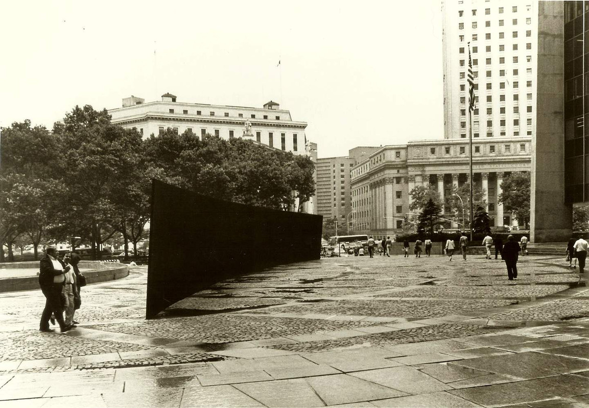
This is such an interesting piece. The first thing I’m struck by is how obstructive it is– spanning the entire length of a plaza, and seemingly cutting off the fountain from the rest of the space and the buildings overlooking it all.
Seeing how utterly large it is makes me wonder what it’d feel like to stand in front of it. I imagine how overwhelming its presence must be, especially as it curves over you, sort of enveloping your field of vision. I imagine it’d really shock the senses and force you to pay attention a bit, especially if it forced you to go out of your way to get around it. The piece is clearly redirecting the flow of movement around it, and I feel like a disruption of routine in that way would really make you pay attention more.
At least I imagine it that way, thinking about how changes to routine usually push me out of autopilot. I don’t know if it'd have quite the same effect if you were a tourist visiting this space for the first time as opposed to being pushed to acknowledge something new in ‘your’ space, but it’d probably still evoke something in you. When faced with something so overbearing and large, some reaction is bound to occur, right? Even if it’s just a feeling of annoyance.
I know that ark isn’t spelled the same way as arc, but I also feel struck by that as the piece sort of emulates the bowing side of a ship/boat to me. I don’t think that’s exactly what the artist intended, but it just came to mind for me, especially since this is by a fountain.
I can’t think of too much else to explore here, but I do really like the piece. I feel like it interacts with its environment (or community, I guess, more than environment) in a cool and interesting way.
Fountain ; 1917 AD ; New York, United States of America ; 38.1 cm × 48.9 cm × 62.5 cm ; Porcelain sculpture

This definitely isn’t what you’d expect in a typical art gallery– it’s a ready-made, ordinary, manufactured urinal, turned on its back and signed "R. Mutt 1917." It obviously doesn’t employ colors, brush strokes, or traditional art materials. In my eyes, it feels pretty clear that this piece is primarily about challenging your notion of what art is and can be.
The first thing that hits you when looking at this piece is the stark whiteness of the urinal, which stands out against any background it's set against (unless you’re using a white background, I guess). This white is the kind of clinical, sterile white you see in bathrooms, which plays into the whole theme of the everyday becoming art. It’s devoid of any additional color, which might be its way of stripping away the distractions, leaving you to confront the form and function– and the unexpected context.
The artist is taking something incredibly utilitarian– an object you’d never glance twice at– and choosing to place it in an ‘art’ context, forcing us to take a second look. By doing this, I feel like they’re really toying with our perceptions, pushing the viewer to question what makes something "worthy" of being called art. Is it the intention behind the object? The placement? The artist’s signature?
The ‘signature’ itself (who knows if it’s a signature or meant to be something else), "R. Mutt," is another layer. It sounds like a pseudonym or a joke, further playing into the whimsical yet provocative nature of the work. This urinal isn’t just a urinal; it’s signed like a masterpiece, which in itself could be seen as a jab at the art world’s sometimes pretentious nature. If it’s not his name and it is meant to be a signature, I wonder if there’s some shame that comes with having made this. It also evokes the idea of graffiti which is really interesting to me.
When you look at the piece, it’s hard not to feel a mix of amusement and a slight irritation or confusion. It’s almost as if the artist is chuckling at an inside joke, and you’re not quite sure if you’re in on it or the butt of it. It sort of (irrelevant-ly) reminds me of how MGMT put out Oracular Spectacular as a commentary on how easy it is to make shitty pop music and how ridiculous it is, and then blew up (and ended up making a lot more music). I wonder if this artist is arguing that this is art, or making fun of arrt like it. Or are they just presenting it, and trying to open up a conversation? Are they just experimenting?
The work generally evokes a sense of absurdity– here we are, staring at a urinal in an art gallery. I think there’s also something interesting here about the fact that it is a urinal– something used to dispose of waste (unwanted things in general). Is there something more to this piece because of that? Art that eats art? The way the art scene eats artists? Decided what’s important? I’m not sure.
At the same time, there's also a deeper, almost rebellious satisfaction in seeing something so ordinary receive such attention. It breaks down barriers, throws "rules" out the window, and boldly declares that art isn't just about beauty or skill– it's about thought, concept, and challenging boundaries. The piece doesn’t just sit there; it stands as a challenge, a question mark against established norms of the art society. It’s not just a piece to look at– it’s a piece to think on, to react to, to discuss. I guess that’s why it might be so important to the art world.
The Two Fridas ; 1939 AD ; Mexico City, Mexico ; 173.5 cm x 173 cm ; Oil on canvas

This is a really beautiful piece by Frida Kahlo, clearly exploring the interaction of both her European and Indigenous heritage, as both wear common 20th century style clothing for women– one in a white European dress and her hair up in a common European style, and the other in a very brightly colored dress. The Indigenous one is also darker skinned and has her legs spread with her breasts quite visible through the clothing, while the European is lighter skinned and sitting in a more ‘ladylike’ fashion (to Europeans) with her body quite concealed and restricted.
The hearts are the clear center of the painting to me. The European Frida is holding a pair of surgical scissors and has seemingly cut open her chest to reveal a bleeding and somewhat ripped-apart heart, with blood dripping onto her dress. One artery runs out of her heart and toward the scissors, where it’s been cut from connecting any further to something else, while the other connects to the Indigenous Frida’s heart– connecting the two. They’re also more simply connected by the fact that they’re holding hands. I feel like there’s a really beautiful harmony and love here, but they’re also at odds with one another. It’s like they’re trying to reconcile.
I think that this painting has both a very internal and external side to it. On one hand, it’s definitely exploring the inner turmoil that comes with being mixed– and especially being mixed due to colonialism, and not just the love of your parents or whatever. There’s a lot of hurt, there, and a need to explore how the two sides can coexist and add to your identity. I also think it could be exploring presentation vs. your internal world and self, although Frida obviously was quite unapologetically herself. But the other side is much more environmental, as Mexican society has long had to deal with a similar struggle– of Indigenous roots and people and European colonialism. My personal opinion is obviously that this one is less two-sided; I will always hold Indigenous knowledge and culture close to my heart. But I do think this is a huge power struggle in society, and especially at the time Kahlo was alive, during the Mexican revolution. I also think the blood on the white, pure European dress could really point to the blood and violence that comes with an attempt to resolve this.
Indigenous Frida holds a little locket (or maybe just a portrait) in her hand, which I assume is of Diego Riverra, since a lot of her art explores her relationship with him. I think this could give the hearts another meaning, since the Indigenous her has a full heart, and the European her has a more ripped-up heart. It’s like some aspects of her are being loved and others being rejected. I imagine she experienced this everywhere in her life, too, whether people loved the European side and hated the Indigenous or vice versa.
Object ; 1936 AD ; Basel, Switzerland ; cup - 4.375 in diameter, saucer - 9.375 in diameter, spoon - 8 in length, 2.875 in height overall ; Fur-covered cup, saucer, and spoon
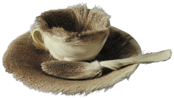
This piece instantly makes me feel curious and uncomfortable, specifically because of its weird juxtaposition of materials and potent symbolism. It's just a cup, saucer, and spoon– common items in a lot of households– but the artist takes these familiar, comforting items and makes them unimaginably odd by covering them in fur. I’m not sure exactly what kind of fur it uses, but it seems like it’s from some sort of deer-like creature, which adds layers of texture and a sort of primal wildness to the piece, which is, at its base, everyday.
The choice of using fur creates a tactile experience that's pretty unusual for objects like tea cups and spoons typically associated with the smooth, cool surfaces of ceramic or metal. I get a few different ideas from this contradiction– mainly that it’s interesting to pair two strongly feminine things (fur & a tea set) that also contradict each other in sensation. But then there’s something more that comes with how this unexpected substitution invites us to imagine the sensation of fur against our lips as we sip tea, which is both intriguing and repellant. It feels almost violent and gruesome in this weird way.
The color of the fur is a creamy beige, blending almost seamlessly with the off-white color we might expect from a ceramic tea set. The subtle color choice doesn't scream for attention but instead whispers for a closer look, emphasizing texture over hue. The natural pattern of the fur might still be faintly discernible, suggesting the wild origin of the material, standing in stark contrast to the domesticity of tea-time paraphernalia.
That initial contradiction of expectation vs. transformation in texture makes me view this piece through the lens of contradiction and challenge. The piece seems to blur the lines between the animate and inanimate, wild and tamed. The fur, a material from a living creature, clings to objects symbolizing civilization and refinement– a duality that can evoke a range of emotions, from amusement to discomfort. It even sort of explores the exterior vs. interior world, like it’s forcing the more raw and pure that usually hides inside out to the surface, letting it obscure the more polite and accepted. Is that bad? Weird? Good?
Regardless, it feels like a nod to the unexpected and surreal, maybe drawing from a dreamlike logic where anything can happen, and the ordinary becomes extraordinary through simple, yet radical alteration.
Improvisation 28 ; 1912 AD ; Munich, Germany ; 112.6 cm x 162.5 cm ; Oil on canvas

This painting feels like a visual symphony, with each stroke and color playing its own unique sound. It’s almost like he threw open the doors to a realm of abstract emotion and let it all wash over him. You can almost hear a soundtrack to this piece– maybe something experimental, layered with a multitude of sounds and textures. I imagine something with piano, definitely; maybe it sounds like Jacob Collier.
Anyway, the technique here very much emphasizes freedom. The brushstrokes are loose and vigorous, seemingly dancing across the canvas without a care, and a blend of sharp lines and soft washes makes us feel both the precision and the spontaneity the artist must’ve been channeling. The painting doesn't just occupy the canvas; it bursts through it, with each stroke asserting its right to exist in whatever form it needs to. There’s no strict boundaries– none at all, really.
Color definitely plays a massive role in the piece. The contrasts are striking, with fiery reds and cool blues clashing, while blacks and whites add a more grounding effect. The colors seem to emulate emotions, conflicts– resonating with an internal energy that's quite intense. The red might stir up feelings of passion or danger, while the blue could be read as deep, contemplative, or soothing. Where the colors overlap or clash, new shades and sentiments emerge.
Obviously, it’s a bit difficult to explore any more traditional symbols in something so abstract, but I’m sure it’s possible to find some. You might see shapes that remind you of mountains or waves, or figures and faces that seem to peek out from the chaos now and then. It feels like the artist is using these familiar elements– morphing them into something new and unrecognizable and pushing us to find personal meaning rather than some universal truth that they’re presenting to us.
I don’t know the artist or the piece, so I can’t really speak to its inspiration, but if it has anything specific, it feels like they might have been inspired by a sense of upheaval, whether personal or societal. There’s a sense of dismantling and rebuilding in the way forms and colors collide– as if he's wrestling with ideas, with the very notions of form and space, and creating something that defies any easy interpretation.
The Kiss ; 1907-1908 AD ; Vienna, Austria ; 180 cm x 180 cm ; Oil and gold lead on canvas

Klimt’s The Kiss is an incredibly iconic piece– too much so to pretend I don’t know it, so I won’t! But even without the weight of its fame, it’s really hard to look at this painting and not feel drawn into its rich, golden world. The technique is mesmerizing– metallic gold leaf dominating the canvas, turning the figures into something very divine-like. It feels both solid and ethereal, as if the couple is suspended in time, existing in a moment so profound it became eternal.
The figures themselves are wrapped in a cascade of textures and patterns. His robe is geometric, almost mechanical, with bold rectangles and dark squares, while hers is softer, with organic, floral motifs that flow into the meadow below them. The juxtaposition between the two suggests a unity of contrasts: the logical and the emotional, the masculine and the feminine. Their poses echo this harmony, too– with him leaning in, protective and almost overwhelming, while she bends back, soft and yielding, yet radiant in her surrender.
The use of color beneath the gold is equally striking. Her robe is filled with bursts of red, green, and blue, like flowers blooming within the warmth of the gold, while his palette remains muted. It almost feels like she brings life into the scene, a garden flourishing within his embrace. She seems to almost be giving him some, though, as just a little bit of life flourishes around his head with the crown of vines. She’s changing him a little bit, or adding on. Together, their connection feels sacred, but also intensely human, rooted in the way their faces meet and her hands clutch his neck. You can almost feel the heat of their closeness and the weight of his hands on her.
The meadow they stand on is small and precarious, almost too delicate to hold them. Beyond it, there’s nothing– just that shimmering gold, blurring the line between the earthly and the divine. It feels almost like a suggestion that love is all there is, a transcendent force that defies boundaries.
Emotionally, the painting feels deeply intimate but also universal. It captures a moment of vulnerability and ecstasy, making the viewer feel like a witness to something sacred. It’s not just about these two figures but about love in its purest, most consuming form. It’s overwhelming, tender, and a little bit otherworldly.
The Coiffure ; 1890-1891 AD ; Paris, France ; 43.3 cm x 30.2 cm ; Drypoint and aquatint on laid paper

This painting sets us in this very quiet, intimate moment. A woman sits on a cushioned stool, facing a mirror, mid-gesture with her hands reaching toward her hair, like she’s getting ready to put it up or take it down. It’s not dramatic, not posed– just this simple, everyday action that’s somehow deeply intimate. Her head tilts slightly forward, her gaze hidden, giving this moment a sense of inwardness, of thoughtfulness. She isn’t doing her hair for anyone else; it feels like a moment of care, of ritual, just for herself. That subtle curve of her spine, the way her body softens into the cushioned stool– there’s something so human about it.
The scene is soft and hazy, not in a way that blurs details but in a way that makes you feel like you’re catching this moment through a veil of sunlight– through a window (but without the creepy implications of that). I’m also not sure, though– maybe it is an intrusion, with this woman turned away and trying to hide herself, with a man seeing anyway through the mirror. That sort of implies that the audience and artist are men, though, which doesn't feel right. I think there’s something softer and less sexual here. It reminds me of how women might get dressed together in the same room, and there’s nothing there; it’s just bodies together. There’s such quiet and privacy, though, that it makes me want to shy away from the idea that she’s with anyone at all. It feels really personally intimate and alone to me… but then whose perspective are we inhabiting?
The lines are delicate and sketch-like, but deliberate enough to give everything its place. It has a very muted, pastel-heavy color palette– mostly pinks, creams, and soft browns, with little contrast, which makes it feel dreamy and private. There’s a harmony to the tones– nothing jars or jumps out too much. It feels controlled, restrained, and kind of still. There’s very little drama or intensity to this, except for maybe the intensity of her contemplation or focus. The soft pinks of the woman’s robe spill into the scene and wrap it in this muted tenderness. Even the mirror behind her reflects more than just her silhouette– the mood itself, hazy and muted, is wrapped in it. The whole piece feels inward-facing.
It’s also definitely hard to miss the Japanese influence in the composition. The flatness of the perspective, the cropped edges, the way her face and body are shaped, and even the way the colors seem to layer over one another like printed textures– all of it feels inspired by Japanese woodblock prints. The pattern on the carpet beneath her adds to that sense of design– it’s less about depicting reality and more about creating a unified visual rhythm.
Emotionally, it’s calming, even meditative. There’s a sense of reverence for the mundane, for this fleeting moment that might otherwise go unnoticed. You might feel a kind of quiet melancholy, too– this is solitude, after all– but it’s a tender, warm solitude. It invites you to slow down, to pay attention to the way light catches on skin or the curve of an arm. The artist really captures the smallness of this moment, and makes it feel universal.
The Scream of Nature ; 1893 AD ; Berlin, Germany and Åsgårdsstrand, Norway ; 91 cm x 73.5 cm ; Tempera on board (though there are several versions and mediums)

It’s hard to pretend that I don’t know The Scream (I'd say most people do), so I’m not going to, but wow is the piece beautiful every time! Looking at it, the first thing that hits me is how visceral and raw it feels. The swirling lines in the sky– blood-red streaks mixing with darker, turbulent waves– give the whole scene this unsettling sense of movement, like the air itself is alive and suffocating. The way the figure is centered, holding their face, feels almost like they’re physically anchoring themselves in this storm of chaos, though the world keeps spinning violently around them. The technique feels frantic, like the brush was moving quickly, almost trembling, to capture something fleeting and urgent. The colors are intense– mostly warm tones like reds, oranges, and yellows, but then there’s the coolness of the blue water, cutting through the chaos with its own icy despair.
The figure itself is almost skeletal, androgynous, faceless but expressive all at once. They seem both human and otherworldly, like they’re a stand-in for everyone, or maybe no one, like they’re dissolving into their surroundings. Their hollow eyes and gaping mouth make you wonder if they’re the source of the scream or if they’re reacting to something even worse that we can’t see. It’s not just a scream you can hear– it’s also a scream you can feel in your gut, vibrating with tension between the fiery red sky and the calmer but eerily still bridge.
There’s these two figures casually walking along in the background– entirely chill and refusing to recognize the chaos, which makes the isolation of the screaming figure even louder. There’s two options here– one in which the two men in the background are disconnected from this awful & awesome scene, and one in which the main figure is the one disconnected from reality, entirely engulfed by something in his own mind. I think the second makes more sense, especially with the knowledge that this painting represents a pretty deep and existential anxiety.
I also wonder if the two men are related to the main figure. I have some ideas about that, but first I’ll back up to explore the setting. The screamer is standing on a bridge, and in the background, we see a pretty clear picture of a body of water of some kind, with little boats floating atop it, and this intense red sky above. I’m intrigued by the boats, which could to me signify the fact that the world moves on regardless of the chaos & emotions you’re feeling. I think that ties into the two men– this calm movement forward of all these other figures adding to the isolation and sense that nothing else is stopping for you. I wonder if they might be friends of his? I think that could add to the intensity there, too– that even people you know & love might not notice or be there with you in this moment.
There’s a sense of dread here that feels both universal and deeply personal. It’s like a sort of nightmare you’ve had where you can’t quite explain what’s wrong, but it lingers anyway. The symbols feel broad but visceral: the bridge is both a divider and a passage, the sky a symbol of emotional turbulence (and maybe what has caused it?), and the figure a kind of soul caught in the middle of it all. There’s something comforting in how it doesn’t shy away from those raw emotions; it’s very vulnerable.
La Gare Saint-Lazare ; 1877 AD ; Paris, France ; 75 cm × 105 cm ; Oil on canvas

This feels like a moment caught in the blur of a busy, industrial city (vibes say Paris?). I’m going to take a stab at it and say this is by Claude Monet because of the distinct style. In this specific piece, the brushstrokes are quick, loose, almost haphazard, as if Monet painted the scene in the time it takes for a train to arrive and depart. Everything about the painting feels alive– steam billowing into the air, merging with the smoke from the trains, creating an almost dreamlike haze that softens the harshness of the metal tracks and industrial structures.
The use of color is particularly stunning. I really love the blues and purples in this piece; I actually thought it was a painting of jacarandas at first glance because of them. Anyway, at first, the palette seems muted– pastel blues, purples, and grays dominating the scene– but as you look closer, there’s a surprising vibrancy to it. There's lots of complementary colors! Oranges and yellows peek through the clouds of steam and lay against the railroad tracks, suggesting the warmth of sunlight breaking through, or maybe just the energy of human movement that fills the station. It definitely gives it a time of day– either early morning (which feels right to me) or later in the evening. The trains themselves are dark and hulking, like these sort of mechanical beasts, but they’re not menacing; they’re part of the rhythm of the place, part of the city’s heartbeat.
The billowing smoke definitely draws you up toward the roof, with intricate ironwork arching upward, framing the chaos below and providing a sense of structure and order. It’s like the station is a cathedral, with its own kind of spirituality– not religious, but rooted in progress and the promise of travel. The figures scattered throughout are almost ghostly– barely sketched in– but that works to highlight how insignificant individuals can feel in the face of something as monumental as industrial progress (particularly in the industrial revolution, I imagine). Even if they’re small and haphazard, they’re there: a vital part of the scene.
Looking at the painting, there’s a pretty strong sense of motion and noise– you can almost hear the hiss of steam, the clatter of wheels, the distant murmur of voices. The muted colors definitely soften that a bit (I’m reminded of a Miyazaki scene, and the soft horn of the trains that might exist in one), but don't get rid of it. It’s not nostalgic, exactly, but it’s also not cold. There’s a strange tenderness to the way the light plays on the steam, the way Monet gives life to the machines and the people who interact with them.
I know Monet painted things less for some deeper meaning or political commentary and more to capture this state of transience, of fleeting experiences (especially in nature), but it still feels like both a celebration and a questioning of progress in the industrial revolution– like Monet was fascinated and maybe a little overwhelmed by the world he was painting.
The Oxbow / View from Mount Holyoke, Northampton, Massachusetts, after a Thunderstorm ; 1836 AD ; New York, US ; 130.8 cm × 193 cm ; Oil on canvas
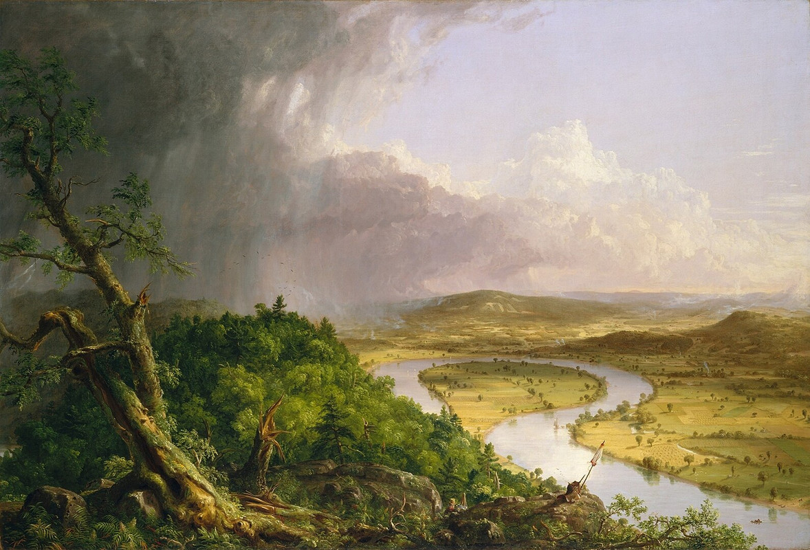
The first thing that jumps out in this piece is the sharp divide– a sort of fuzzy diagonal slash– between two worlds. On the left, there’s a chaotic feeling. The sky churns with dark, looming clouds, streaked with light as if it’s fighting the peace and calm it’s trying to overtake. Trees seem to bend and break in the wind, their jagged forms reaching out. One tree in particular takes up the foreground, clearly cracked into pieces and destroyed. The land feels wild, untamed, and alive, but also threatening. There's a heaviness to this side– a sense of struggle and potential destruction.
On the right side of the diagonal, it’s like a completely different painting. The land opens up in soft, rolling fields, framed by these very calm curves of the river's oxbow shape. I’m curious if the river is man made or natural, especially because of the farmland around it. I also can’t tell if the storm has passed, here, or if it’s about to face it. Either way– the colors are warm and inviting, with golden yellows and soft greens. This side is all peace and harmony, touched by human hands but not overwhelmed by them. Tiny specks of houses dot the landscape, almost blending into it, and it feels like a vision of what some people might imagine when they think of the "good life."
On the left, dark browns and murky greens dominate, while the right side glows with a sunlit palette. It’s like nature’s duality is being laid bare: untamed wilderness versus cultivated land. But the divide isn’t clean. The edges blur slightly, as if to remind us that the wild and the controlled are constantly pushing up against each other.
There’s a tiny figure tucked into the scene– pretty easy to miss. He’s standing in the wilderness and holds an easel, painting the scene we’re looking at. It definitely seems like the artist is trying to put a little Easter egg of himself in there, but it also adds something more to the piece. It makes me wonder if maybe this painting is also talking about perspective– how we frame nature, or how we choose to see it. It doesn’t feel like the wilderness is inherently bad or the farmland inherently good, but there’s a tension between them, and the figure makes you feel like you’re being asked to think about where you’d stand. Are we intruders or maybe stewards? Both? Are we taming this land? Ruining it? This piece seems to suggest we’re making it better, though I wouldn’t agree. Especially in the context of settlers and cultivating land (whether rightfully or not), this question is especially important.
Liberty Leading the People ; 1830 AD ; Paris, France ; 260 cm x 325 cm ; Oil on canvas
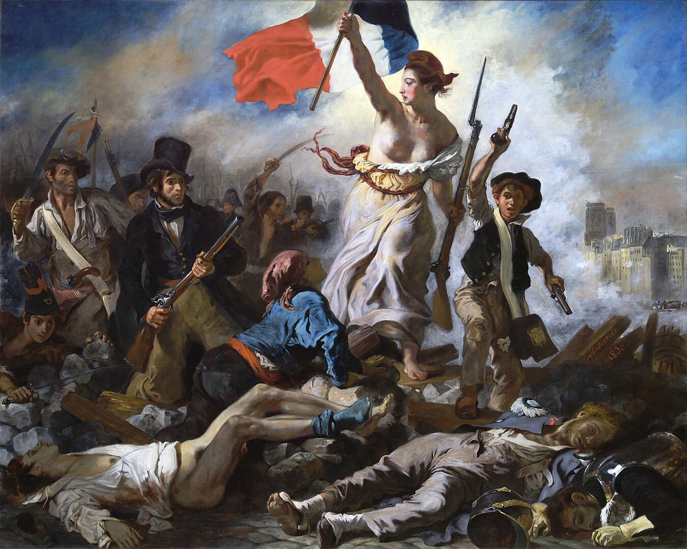
This painting clearly captures the fervor and chaos of the July Revolution in France-- I'm only thinking it's not the French Revolution because she doesn't seem to be dressed in clothing that fits with the time period of the French Revolution. At the heart of the painting is a figure I’m going to take a chance and identify as Liberty– personified as a robust, bare-breasted woman leading a diverse crowd over a barricade of fallen bodies. In one hand, she holds the French tricolor flag, and in the other, a musket, embodying both nationalism and revolution. I’d argue that her raised flag also specifically symbolizes the values of liberty, equality, and fraternity, and acts as the painting’s focal point, rising above the chaos and pulling the viewer’s gaze upward. From the positioning of the flag, herself, and those following her comes a triangular composition that really draws my eye upward from the chaotic struggle at the base to the flag soaring high– full of hope. The arrangement creates a sense of upward motion, as if the crowd is pushing toward freedom and victory.
The artist uses light and shadow in a very dramatic way– amplifying the painting’s emotional intensity. Liberty is illuminated in a very golden light, elevating her to a near-divine status, while the smoky background is tinged with earthy tones, underscoring the grim and violent reality of the battlefield. The bright red, white, and blue of the flag also stands out starkly against the muted palette, emphasizing a sort of central role as a symbol of national unity and revolutionary fervor. That said, the red, white, and blue repeat in little sections all over the piece. At the same time, the visceral details of the fallen bodies, rendered with gritty realism, remind viewers of the human cost of freedom– one man even with his pants gone, clearly violated and murdered.
I feel like every figure in the painting carries some symbolic weight. Liberty definitely evokes classical ideals of freedom and truth– she’s absolutely an allegorical figure for France’s freedom. Her bare chest seems to reinforce her role as a maternal and unifying force (maybe nourishing force), while her musket obviously connects her to the revolutionary struggle. She’s barefoot, too– emphasizing freedom. A man below her grovels at her feet, seemingly in awe and excited by what she is/what she represents, especially as a sort of… protector and birther of freedom in her country. The figures around her are all incredibly diverse, and represent different cross-sections of society: a bourgeois man in a top hat, a worker in a white shirt, and a young boy with pistols. I wonder if the young boy is a symbol for America, too– which is quite young at the time, and has sort of American, cowboy-like clothing. Regardless, they together embody the collective effort of the revolution, cutting across class and age. The dead, dying, violated at their feet really intensify the need for and cost of revolution.
The Swing ; 1767 AD ; Paris, France ; 81 cm × 64.2 cm ; Oil on canvas

This piece is immediately such a playful, layered painting– it feels like a snapshot of indulgence, mischief, decadence, and romance wrapped up in pastel colors. The girl on the swing is obviously the focal point and the heart of it all– her bright pink dress making it hard to miss her. It’s very luxurious, spilling over the swing like it has a personality of its own, symbolizing wealth, femininity, and maybe even desire. She looks entirely like a flower, which has a few meanings that’re sort of contradicting and fun– innocence, desire, and also the fact that when flowers are blooming, they’re also attracting mates. She’s carefree and confident, mid-air, fully in control of the scene– even as she teases both the man hidden in the bushes below and the one pushing her swing. That kicked-off shoe is a small but brilliant detail– a sign of abandon, a little rebellious moment in an otherwise orchestrated scene, like she’s saying, “Catch me if you can.” It feels like she’s flinging all decorum out the window, and also sort of mimics the energy of being freely and excitedly in love. This is especially true because it also shows off her ankle, which is obviously quite scandalous for a girl of her perceived status.
There’s also the man in the bushes, looking up at her with a not-so-innocent gaze. His hidden position and craned neck makes it clear he’s sneaking a look up her dress, and the way he reaches toward her– almost like he’s trying to grasp her or her attention– adds a layer of tension to all the fun. It’s interesting that he seems to be in a bush of roses, since she’s reminiscent of a rose– maybe trying to suggest that he’s sort of a player? Across the painting from him, the man pushing the swing seems older and more shadowy, possibly oblivious to what’s happening right in front of him– especially because he’s literally in the dark of the painting. Could he be her husband? There’s also the possibility that he knows she’s with others, but can’t really care– maybe leaning into infidelity in loveless, aristocratic relationships. Either way, there’s a triangle of power and flirtation happening that keeps things interesting.
I love the use of the two cherubs that sort of mirror the two men, as well– like the one in front of her that’s shushing her, which seems to imply that maybe she’s having an affair, and then the two that also seem to be looking up at her like the man in the bushes. It definitely adds to the sort of affair-like cheeky and scandalous energy.
The colors and lighting really bring everything to life. The greens and pinks are soft and vibrant at the same time, creating this lush, dreamy environment. Light filters through the trees, casting a glow on her dress and highlighting the key players in the scene. But the darker areas– the shadows in the foliage, the hidden corners– add just enough mystery and unease to balance out all the charm. It’s like the artist is reminding us that even in a playful moment, there’s always something just out of sight. One side is beautiful and bright, and the other feels odd and out of sight. The brushwork is definitely another highlight. Everything feels light and airy, like the painting is in motion. The way the artist handles texture– whether it’s the silkiness of her dress, the roughness of the tree bark, or the softness of the clouds– makes the scene feel tactile and alive. You can almost hear the swing creaking, the leaves rustling, and the laughter echoing.
In general, the painting has this mix of feelings that’s hard to pin down. On one hand, it’s carefree and indulgent, full of laughter and sensuality. On the other, there’s this undercurrent of tension, maybe even danger. The swing itself feels symbolic– she’s suspended in mid-air, weightless and ungrounded. It’s a moment of freedom, but it’s also fleeting. The man in the bushes and the older figure (literally) pulling the strings remind you that this freedom isn’t entirely her own, and also emphasize that it’s sort of taboo. Knowing that this piece is French also lends itself to the idea that it has to be playing on the idea of overt and unnecessary decadence– especially in higher class people and places like the Palace of Versailles. It seems like it’s commenting on that decadence, especially with how idyllic the painting sort of feels.
Spaniard and Indian Produce a Mestizo ; 1715 AD ; “New Spain” aka Spanish colonial Mexico ; 102 cm x 126 cm ; Oil on canvas
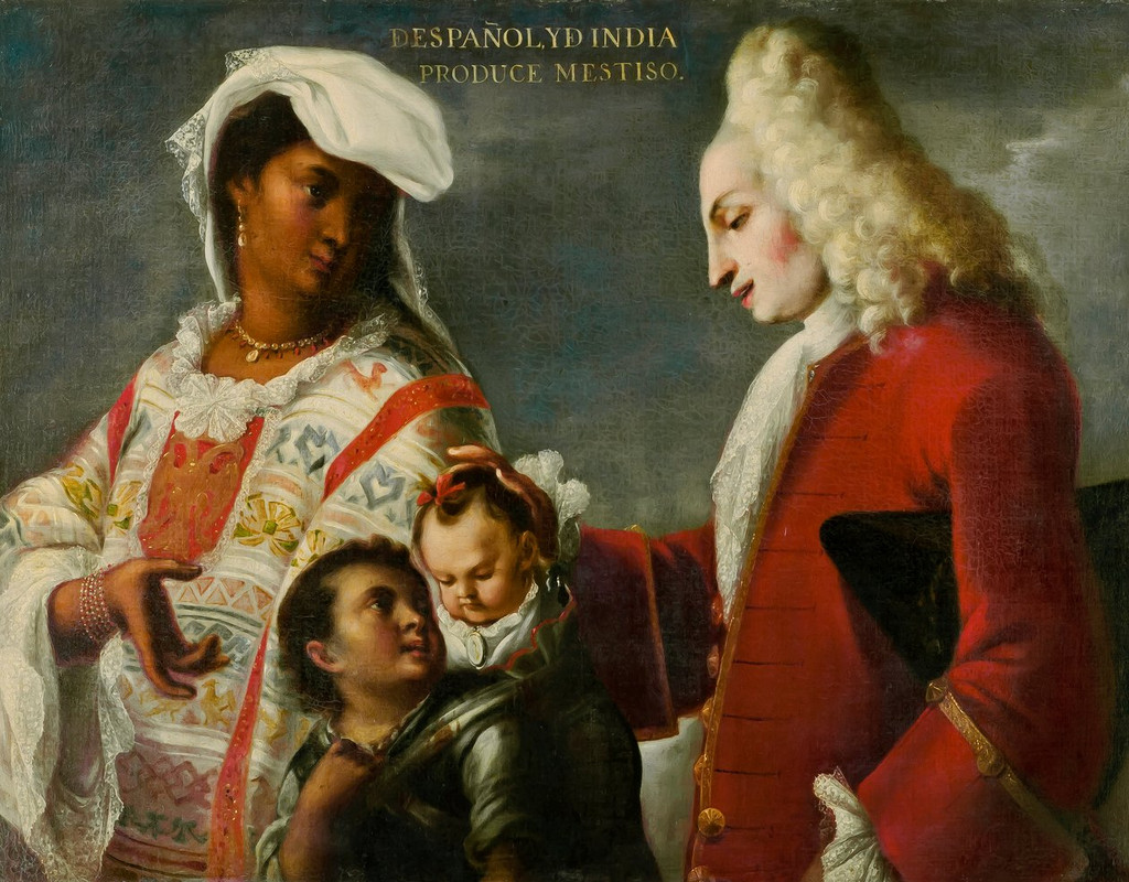
This painting makes me feel uncomfortable right away. At the top of the painting are the words “Depañol Yd India Produce Mestiso,” which clearly signifies that this painting is attempting to discuss the casta system (for better or for worse). It presents a complex family interaction among four figures, each marked by distinct features and clothing that communicate cultural and social tensions. The woman on the left wears white clothing that’s intricate and patterned, with vibrant, warm colors and textiles that hint at Indigenous or even African influences. Her head is covered, possibly suggesting an imposed modesty or an attempt to assimilate into European customs. Her gaze is also directed downward and away from the father, which sort of indicates submissions– likely forced– but also (in my hopeful heart) feels a bit like quiet resistance or emotional distance, as if silently protesting an imposed structure and colonial lens. The man, in stark contrast, is dressed in European-style clothing, his posture and gaze carrying an air of superiority.
In the center, we see one figure who could be an older child or a servant of some kind standing beside the mother, holding an infant in their arms. If it is another child of theirs (or just of hers), the arrangement shifts the familial dynamics. Rather than the mother directly holding the baby, the older child takes on a caretaking role, suggesting a shared responsibility within the family or possibly the necessity for children to support each other in these families. This positioning can imply that children (specifically non-white children of any mix) in colonial societies often took on adult responsibilities early, shaped by the pressures and constraints of the colonial system. If they’re a servant of some kind (which I think is also emphasized by the difference in skin color between the two children, with the older one being darker), it still definitely emphasizes the presence of the casta system and mestizaje, and their impacts on successive generations, as colonial societies would have categorized these children based on appearance and parentage.
The artist’s intent might have been to document or validate this system, portraying the results of cross-cultural unions as a visual taxonomy rather than a celebration. In general, the painting seems like it’s trying to paint the scene as more beautiful than I might imagine mestizo relationships actually were, and could possibly be an attempt at propaganda to make it seem more beautiful for Indigenous people to have children with white people, thus turning their population more white.
It also definitely echoes the dynamics of power and hierarchy prevalent during the colonial period. The man’s gesture toward the children– a seemingly paternal or possessive touch– implies ownership or control, reinforcing his authority. He looks at them with an expression that could be interpreted as interest, but not necessarily warmth. This dynamic reflects a clear colonial mindset– one of dominance over and objectification of non-European peoples.
The painter uses a lot of contrasting lighting and clothing textures to draw distinctions between the figures. The man’s clothing and pale complexion catch more light, emphasizing his dominant presence, while the mother’s darker skin and elaborate garment reflect less, rendering her more subdued in the scene. This technique seems to visually reinforce the societal hierarchy imposed on these figures, with the European figure quite literally illuminated as the focal point.
The painting evokes a lot of mixed emotions: a sense of tension, sadness, and discomfort at witnessing this racial hierarchy encoded in art. It obviously reflects a forced merging of cultures, with themes of control and subjugation subtly conveyed in the figures’ body language. It’s clear that the work both reflects and reinforces colonial ideologies, leaving us to question the humanity and agency of those depicted within this colonial framework.
Marriage A-la-Mode: 2, The Tête à Tête ; 1743 AD ; London, England ; 69.9 cm × 90.8 cm ; Oil on canvas
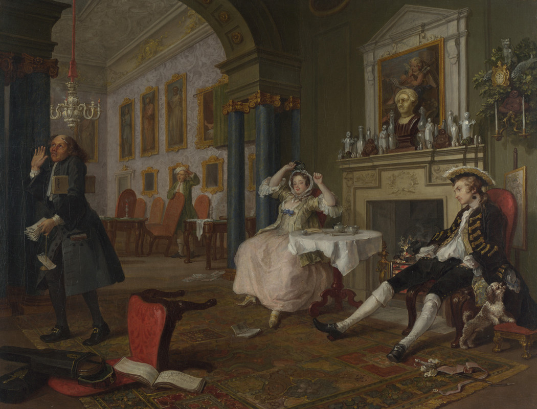
This piece definitely has a strong sense of sarcasm which seems to mix with some social commentary. Two people sit beside each other, seeming entirely indifferent to the other’s existence, and the room around them is both grand and incredibly cluttered. It almost seems like the afternight of a drunken night/party; there’s a broken sword on the floor (hints of a duel?), an instrument tossed aside and onto a fallen chair, and a dog sniffing at a woman’s clothing of some kind in the man’s pocket. I wonder if the two sitting people are supposed to be married or together, since that tiny detail with the dog would make the most sense if it’s making a statement about lack of fidelity or loyalty.
Aside from the indifferent couple, two other figures add depth to the scene. There’s the accountant on the left, looking completely fed up as he holds a stack of unpaid bills. He’s kind of like an anchor in the scene, representing the reality that the couple is ignoring, and he has a look of exasperation and resignation that's directed out of the frame, like he’s trying to signal to us, “These two are a lost cause.”
On the other side of the room, there’s a servant who’s caught mid-yawn, holding a cup of coffee as he seems to be cleaning up the aftermath. His bored expression and casual stance suggest he’s seen this scene play out too many times to be shocked. These two figures underline the theme/energy of disinterest and wastefulness– the accountant and servant are the “grounded” characters surrounded by wealth, but the scene shows that they’re the only ones dealing with the consequences of the couple’s lifestyle. Together, these figures add a sense of frustration and irony to the painting, contrasting with the “whatever” attitude of the couple and helping drive home the social critique this painting seems to aim for.
In general, I get the feeling that this piece is trying to critique how frivolous and superficial British aristocracy (what this painting seems to depict) really is. Everyone has these over the top expressions and energies about them, and it’s like their entire reality that we can imagine they present to the world is a facade– an illusion.
The painting uses a surprisingly muted color palette for such a chaotic scene— soft browns, greens, and creams that give the scene a hazy, almost tired feeling, like the room is recovering from the night as much as its owners are. There are small pockets of vibrant red, though, like the insanity of it all is still going to continue; it’s not over. The wife looks relaxed, but also has this sort of cheeky energy as she puts her hands up (maybe to stretch), and the husband's clearly exhausted, sprawling across the chair. These add to this “over it” vibe, painting a picture of aristocratic life as hollow and repetitive. They’ve got all the material luxuries, but they’re missing any real connection, and it’s going to stay like that.
The artist also plays with space to reveal character; the two sit far apart, barely looking at each other, emphasizing their emotional distance. Their technique is detailed and sharp, using objects in the room to tell stories: portraits, scattered items, and that ignored servant in the doorway, all adding to the chaotic feel. The work feels like a callout, like it’s saying, “Look at the ridiculousness of it all.” It’s satirical, but there’s also a sense of sadness behind it– a feeling that these people are wasting their lives and their privilege on shallow pleasures.
Woman Holding a Balance ; 1662-1664 AD ; Amsterdam, Netherlands ; 42.5 cm x 38 cm ; Oil on canvas
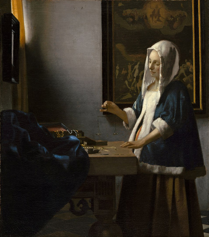
The first thing that catches my eye about this piece is the lighting. The figure depicted is cast in this beautiful ray of light coming from a window we can only see the corner of, and illuminates most of the room except the bottom left dark corner– sort of like there’s a diagonal drawn through the piece. The light just barely catches her hand, which holds a balance (or scale), and the balance gets to occupy a space right in front of the frame’s dark corner and in the exact center of the painting. The window also paints her in such a soft lighting that her sort of pensive countenance feels even more enhanced and intimate– like I’m interrupting her.
The most obvious thing to me about this piece is that right behind her (on the right of the painting), we see a depiction of The Last Judgment, bathed in light, and that on the left of the painting, we see a lot of earthly treasures/goods that are bathed in darkness. The scale she’s holding is positioned directly between the two, almost balancing them. I really love that there are two sort of diagonals in this piece (one that draws a line through the riches, the balance, and the Last Judgment painting and one that draws a line of darkness vs. light).
I think this is definitely trying to display a conflict between materialism and morality, but is also specifically encouraging the viewer to live a holy life. It sort of calls to mind the idea of Temperance (the tarot card) for me. She definitely has a holy or earthly energy to her, and feels like she’s calling us to be like her– and her depiction seems to be a sort of reference to the Virgin Mary.
She has a mirror in front of her, as well, which seems like it could reference a few things. One option is just that it’s another suggestion of vanity, materialism, etc, but I personally prefer the idea that it’s asking her (and through her, us) to reflect on her/our actions and explore what decisions we make. This painting is a huge moment of reflection for the figure, and it’s definitely inviting us in to reflect as well.
The Hunters in the Snow ; 1565 AD ; Vienna, Austria ; 117 cm × 162 cm ; Oil on wood
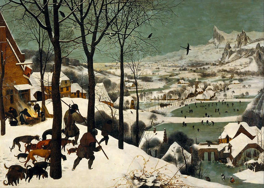
This is clearly a winter landscape that meets you with an immediate sense of calm, almost as if you can feel the cold seeping into your clothes. The hunters at the top, silhouetted against the snow, seem to anchor the scene with a quiet exhaustion. Their dark figures stand out sharply, casting shadows across the snowy ground that tell of their journey and the scarcity of the season. I almost feel a kind of sympathy for them because of how easy it is to sense the hardships of winter— bare branches above them mirroring their own sparse catch. The scene doesn’t glorify them, but rather situates them within the broader world, a part of the natural cycle they’re bound to.
The hunters’ dogs sit and walk beside them, clearly carrying a story of their own. Their bodies mirror the hunters’ weariness, with heads hung low, tails barely lifted, like they’re too worn down by the cold and the journey to do much. They also seem quite skinny and hungry, and I’m curious about the fact that not all of them are hunting dogs. Their positioning, slightly behind their masters, emphasizes their loyalty and the difficulty of being sort of ‘in this together’. The dogs’ placement feels intentional, reinforcing the sense of unity and shared endurance. They’re not animals in the background, but active participants in this story of survival, each step they take adding to the scene’s quiet, somber tone.
Beside the hunters and their dogs, a small fire crackles, its warmth barely visible but also crucial, a quiet resilience against the icy palette that surrounds it. This is where you see the contrast of warm and cold— life continuing in small acts despite the winter chill. It does seem a bit desperate, though, too.
Looking past the foreground, the landscape is composed in such a way that your eyes naturally travel down the slope, guided along by the angles of the trees and paths, until you reach the village below. Here, the positioning becomes clear: this isn’t just about the hunters, but a snapshot of the entire community, each layer revealing people going about their lives. Villagers are scattered across the ice, skating and playing, adding a sense of motion and lightness. The people are tiny compared to the massive expanse of the snow-covered land, but they still fill it with energy. The contrast between the hunters’ labor and the villagers’ leisure feels deliberate— a hint at the communal endurance that defines the scene. It’s as if the painting is saying that everyone, whether toiling or playing, is part of the same rhythm.
After leading you down to the lake and village, the painting continues to draw your eye further, where the sky opens up and a flock of birds sweeps across the background. Their dark forms create a contrast with the softer, grayer sky, giving the feeling of movement and freedom, almost as if they’re watching over the scene from above. Beyond the birds, the landscape stretches out to reveal the vast, snow-covered mountains, towering and imposing. These peaks feel distant, almost otherworldly, casting a shadow over the entire valley below. It feels like it’s leaning more into the intense and harsher side of nature, contrasting with the sort of hope and joy we feel in other parts. Together, the birds and mountains create a sense of vastness that makes the figures below seem small yet connected to something greater, almost reminding us of nature’s scale and endurance.
The colors in this piece— mostly whites, grays, and soft greens— lock you into a frigid winter atmosphere. The limited palette brings the scene into sharp focus, almost crystallizing it; you can feel the cold through the screen or canvas. At the same time, there’s a sort of softness to it— the snow isn’t harsh or blinding, but blanketing, creating a muted calm that feels peaceful rather than barren. This sort of brings to light the theme of resilience in difficult times— how even the harshest season carries a kind of quiet beauty.
Through these layers, the artist uses depth and positioning to show the natural flow of life within the community. The slope and winding paths draw you in gradually, moving you through different vignettes within the larger scene. The painting seems to evoke a sense of timelessness, where every small act— skating, hunting, or tending to a fire— contributes to a larger whole. I also feel, though, like it’s a little bit too magical. Knowing this was made around the 16th century, it feels like it’s sort of a wish for what could be, while their actual winter might be less joyful, magical, beautiful, etc.
Venus of Urbino ; 1538 AD ; Venice, Italy ; 119.1 cm × 165.1 cm ; Oil on canvas
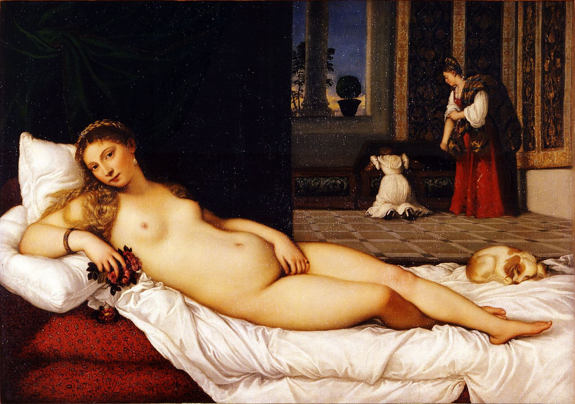
This painting, which I recognized as a depiction of Venus, is instantly captivating with its blend of sensuality and elegance. It sort of draws me into a quiet moment of intimacy– especially with the way Venus is looking at the viewer. To me, her gaze is one of the most compelling aspects of the painting. It feels direct yet soft, as if inviting the viewer into a private moment without hesitation or shame. She’s also reclining as she looks at us– nude against the backdrop of a rich, domestic interior– creating a striking contrast between her exposed form and the more structured, detailed surroundings. She’s very unashamed of her nakedness, and seems perfectly comfortable in this– possibly even touching herself (though her hand could just be resting by her vulva). The light and positioning highlights her body (specifically her stomach or maybe womb, specifically), but her darker eyes still draw your attention, as does her easy smile. The sense of ease in her expression, paired with her relaxed posture, definitely evokes a sort of confident sensuality, which feels purposeful in how Venus is presented as both a figure of beauty and control.
I’m kind of curious as to who the audience is for this. It feels really intimate and private, obviously– especially with the intensity of her gaze, and how much it feels like it’s just you and her, even with the servants in the background– but I wonder who it’s meant for. Is it for someone’s wife? Someone’s husband?
The piece also feels really impressive technically– things like the lush texture of sheets and drapery and the vibrant contrast between her pale skin and the deep red fabric really standing out. The way the light hits her body feels like it adds a warm glow, making her appear almost sculptural, and every fold in the fabric– particularly the heavy drapery behind her– has weight and texture, creating a dynamic sense of depth in the painting.
The painting seems to speak to themes of eroticism and domesticity, blurring the lines between the two. There’s lots of small details that play with that, all drawing me into her world. For example, the presence of the dog, often a symbol of loyalty and fidelity, along with the soft interior setting, suggests a more private, lived-in world. Its curled, resting pose reflects comfort and trust, possibly underscoring themes of loyalty in love. At the same time, Venus’s open nudity against this backdrop feels like a bold juxtaposition, perhaps suggesting a balance between sensual pleasure and the everyday life of a woman. The same goes with the roses (and the red in general in this painting), which seem to emphasize love, sex, etc.
Another big thing I notice in this is the servants in the background, which offer a sharp contrast to Venus’s stillness. They seem to be searching through a chest, which feels domestic, almost mundane, in comparison to the goddess’s sensual presence. This could symbolize the everyday nature of love or sensuality being intertwined with the routines of life. Their placement in the painting feels like they’re secondary to Venus, emphasizing her centrality and dominance in this private moment. The busy nature of the servants could also highlight Venus’s calm and control, suggesting that while life moves around her, she remains in command of her space and her sensuality.
The School of Athens ; 1509-1511 AD ; Vatican City, Rome, Italy ; 500 cm × 770 cm ; Fresco

This painting immediately commands your attention with a very grand scene and a sense of balance throughout it. The first thing that stands out to me is the architecture— towering arches and deep columns that draw your eye into the space, giving the scene both depth and majesty. The figures are posed dynamically, but still arranged in a circular pattern, having an almost choreographed energy. Their gestures are varied— outstretched, upward, and toward one another— suggesting lively conversation, debate, and exchange of ideas. It makes me imagine philosophers or students.
There’s a very subtle but effective use of light in this, too. Light pours into the space and illuminates the central figures, but bathes the surrounding characters in a soft glow, creating contrast and adding dimension. This light seems almost celestial, maybe signifying clarity, wisdom, or discovery— like something grand is being revealed. That said, I feel like the shadows under the arches and within the folds of the robes anchor the figures and keep the scene from becoming too ethereal. It’s still grounded.
The characters themselves are also quite different and varied, each distinct in both expression and posture, which invites the viewer to imagine their thoughts, moods, and intentions. Some seem absorbed in contemplation, while others appear animated in conversation. I do think there’s a sort of focal point of two dudes in the middle who are also sort of surrounded by people watching them— maybe more important philosophers? They seem to be discussing different viewpoints (one with his arm out, one with his arm up). This mix of serenity and action breathes life into the painting for me, and gives it a sense of movement despite its stillness.
The colors of this piece also add to that vibrancy— bold reds, blues, and greens against the softer tones of the architecture creating a very intense, charged energy that contrasts with something more peaceful in the setting/atmosphere. The blue in particular draws your eye as well! In general, the piece gives me a feeling of curiosity, inspiration, and maybe even reverence? It’s sort of like it’s inviting me in, asking me to consider what ideas are being shared, while simultaneously being almost overwhelming in its grandeur and scale.
Dürer’s Adam and Eve ; 1504 AD ; Nuremberg, Germany ; 25.1 cm x 19.8 cm ; Wood engraving
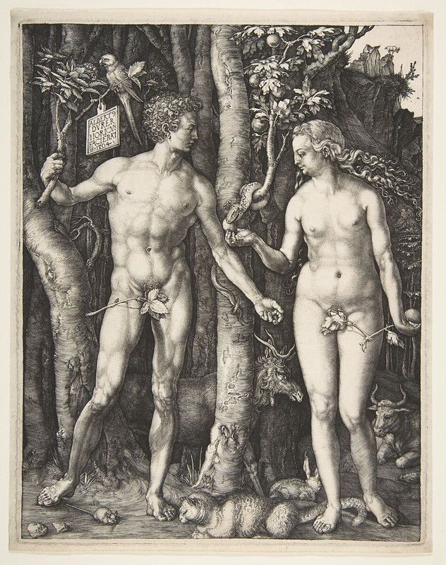
This piece interests immediately, as it seems to be an engraving– and an incredibly masterful, impressive one at that. It captures not only the biblical moment of humanity’s first sin (I imagine so, at least, from context clues), but also a sense of balance and tension. The figures of Adam and Eve stand at the center of the composition and embody pretty standard ideals of classical beauty: Adam’s muscular form contrasting with Eve’s softer, more graceful posture, positioned symmetrically to one another and standing in contrapposto. This symmetry gives the piece a sense of harmony, as if they are caught in a moment of stillness before everything changes.
There’s an interesting detail– that the snake is handing her an apple, but Eve already holds a forbidden fruit in her other hand, her gaze focused on Adam (almost like she’s inviting him to eat this without making him aware she’s already done so). Adam, on the other hand, is grasping a branch of the tree of knowledge, and seems to hesitate, not fully aware of the gravity of what’s about to happen but already suspicious. The animals scattered throughout the scene– like the serpent, the parrot, and the elk– each seem symbolic of different virtues and vices, their presence adding a richness and complexity to the scene. The serpent, coiled around the tree, is particularly striking, with its sinuous form. It seems like a visual representation of temptation winding its way into paradise.
There are some branches covering Adam and Eve’s genitals, insisting that they aren’t perfectly natural (or maybe that to be natural is still to be modest). These branches as coverings feel almost fragile, as if the moment they bite into the fruit, the branches will wither away, leaving them exposed not just physically but spiritually as well. It heightens the tension between purity and shame, suggesting that this state of innocence is temporary, and the knowledge they’re about to gain could strip them bare in every sense.
Adam is holding a branch (I wonder if it’s from the tree of knowledge or something) that has a sort of sign post on it which I can’t quite read (though I doubt it’s in English or Spanish anyway). It could be an author’s signature, though, or a message of some kind? Even not knowing what it means directly, its placement definitely does contrast with the natural surroundings, adding a human-made element that maybe hints at the human habit of labeling and taking ownership of what was once pure and unspoiled.
There’s something sort of haunting about the innocence in their faces, coupled with the dark, tangled wilderness around them. The dense foliage seems to press in on them, almost as though nature itself is waiting, holding its breath. For me, this creates a sense of inevitable loss– Eden is both lush and claustrophobic, teetering on the brink of destruction. The fine details of the leaves and branches– the way light and shadow are etched into the background– make me feel the overwhelming presence of this paradise, and yet it’s veiled in this sort of atmosphere of inevitable doom.
In my eyes, the engraving is reflecting on the fragility of innocence and the weight of choice. Adam and Eve seem poised between their perfect forms and the burden of human imperfection. The scene draws me in through its beauty, but also leaves me with a sense of melancholy because of the shadow of what’s to come.
The Birth of Venus ; 1484-1486 AD ; Florence, Italy ; 172.5 cm × 278.9 cm ; Tempera on canvas
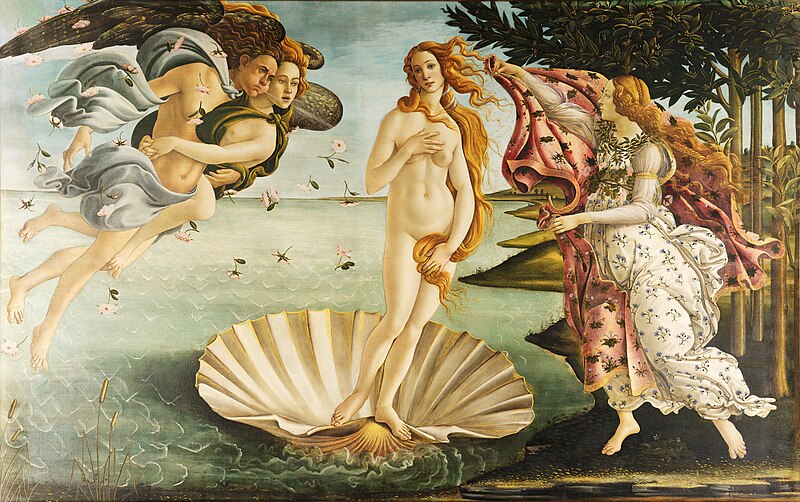
This piece, which I know is called The Birth of Venus, is definitely a more vibrant, modern take on classical mythological themes— instantly striking with its bold use of movement and color: The figure of Venus is clearly central, but also feels surrounded in a very comforting way. She’s emerging from the sea, but it almost feels like she’s a child being pulled from a bathtub and wrapped with warm towels. She’s covering herself up a little— specifically around her pelvis and her breast— but doesn’t seem like she actually cares too much about being modest, and the woman reaching for her seems almost frantic and excited to get her covered in a cloth. She feels very alive, too— the sweeping, flowing lines of her hair and the surrounding waves creating a sense of motion that feels almost like the painting is breathing.
Venus’ pose is confident yet serene, and evokes an aura of renewal and empowerment almost as if she’s reclaiming her space in a contemporary context, having been stuck in tradition and the past for so long. Her gaze isn’t directed outward but seems introspective, adding depth to her character as more than just an idealized figure of beauty. Because of the depiction of her rising from the sea in this shell, she becomes a symbol of rebirth in a personal sense, too— maybe hinting at themes of self-discovery and transformation.
Three other figures flank Venus, contributing to the overall scene: to her left, a pair of what look like wind deities blow softly toward her, their breath gently guiding her toward the shore, with a whole lot of flowers caught up in their breath. Their presence adds a very mystical, ethereal quality to the scene, connecting her strongly to nature. To the right, a female figure, draped in flowing cloth, leans toward Venus with a garment, as if ready to clothe her once she reaches land (again, evoking that image of a child). They frame her in a moment of divine emergence, while the calmness of the sea and the dawn in the background suggest a peaceful, new beginning. There’s a contrast between the softer tones of Venus and the more saturated colors around her that makes her figure stand out, but it also highlights the sense of harmony between her and the natural world she inhabits. The water doesn’t fully recede into the background, but encircles her, and even caresses the shell she stands upon, almost like it’s trying to help guide her. The shoreline flows in and out across the coast, almost like it’s beckoning her forward, and the trees’ branches almost seem to be waving at her.
In general, it’s a very soft yet sort of empowering scene.
The Arnolfini Wedding Portrait ; 1434 AD ; Bruges, Belgium ; 81.8 x 59.7 cm ; Oil on canvas
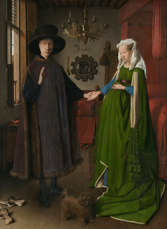
This portrait strikes me instantly with the sense of depth and intimacy, but also distance, within it. It feels almost intrusive, like I’m witnessing a private moment frozen in time. The couple, with their solemn expressions and clasped hands, have a sort of quiet tension between them. Their faces seem pretty still– not like they’re talking– but there’s a subtle undercurrent of something like uncertainty or contemplation beneath the formality of their poses.
The mirror in the center of the piece draws me in, and sort of makes me feel as if I’m not just a viewer, but a part of this scene. It’s a kind of portal that extends the space beyond the frame, showing a reflection of the room that has a few more figures. I’m sort of wondering about the figures reflected in the mirror– their purpose and the dynamics they bring to the moment. There’s two– I wonder if one is supposed to be me? And maybe the other is the artist?
The textures in the clothing and objects are another really beautiful element. The folds of the woman’s dress, with its rich, luxurious fabric, seem to drape and fall with weight, while the fur trim has a very tactile softness that contrasts with the hardness of the wooden floor or the cold, shining metal of the chandelier. There’s many objects scattered around the room, too– the bed, the shoes, the dog– and feel purposeful, with each detail seeming carefully chosen to add to a sense of narrative, though I‘m not sure what narrative. The dog specifically reminds me of loyalty and faithfulness, too, so I definitely get that the couple’s relationship is the focus of our story. On the chandelier, as well, there’s only one candle lit on the man’s side, which is an intriguing detail– I wonder if she’s less alive in their partnership (which feels possible when added to the sort of tense, uncomfortable look they’re sharing), or maybe literally dead.
Of course, the most obvious aspect of this painting and its narrative is the woman’s apparent pregnancy. Her rounded belly, accentuated by the way she holds up her dress, definitely suggests the presence of new life. While she might not be pregnant (could be fat, or her holding her dress up and out in a weird way), the visual cue is strong enough that it immediately makes me consider the significance of fertility, lineage, and family/relationship in this scene. She doesn’t seem to be wearing a ring, though, which makes me less inclined to believe that she’s actually pregnant.
That possibility introduces a layer of vulnerability and tenderness. Her body language feels guarded yet proud, contrasting with the formality and stiffness of the man’s pose, and they seem sort of uncomfortable and unsure with one another. I like that we don't know the couple’s story— whether they’re at a significant moment of anticipation or whether the portrayal of pregnancy is symbolic of something deeper, like wealth, status, or legacy. It adds another dimension to the already intimate, quiet moment the painting captures, making it feel rich with possibilities beyond what is explicitly shown.
Röttgen Pietà ; 1300 AD ; Rheinisches Landesmuseum, Bonn, Germany ; 34.5 in height ; painted wood
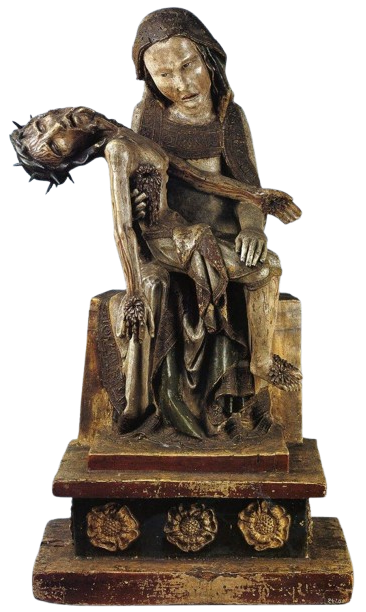
This is a really incredible, striking piece. It’s very stylized and harsh– Jesus adorned with taut skin pulled over visible ribs, open wounds, with a pretty horrific look on both his and his mother, Mary’s, faces. She looks distraught and agitated, and even exhausted, holding her clearly dead son with such a gruesome body. In a lot of images of Mary holding Jesus after his death, she seems to have an understanding (maybe given to her by God) that there’s a reason for this, and a way forward, and so she seems more at peace, but here, she’s sort of viscerally angry and confused. I feel really in awe looking at this piece, just sort of stunned by the violence and sharpness of it all.
I love that we can see all this blood dripping down and across them both, as well. It just feels so much more intense than anything we’ve seen before from Christian art. It’s a very deliberate departure from the more beautiful and pristine.
I can definitely feel a sense of trying to connect divinity to humanity– showing that even Mary and Jesus are sympathetic to and can understand our intense suffering. It feels like the kind of piece you’re meant to contemplate and mourn for. It allows for a more personal and emotional connection with these religious figures that comes with an understanding that you do have similarities.
Last Judgment Tympanum ; 1050-1130 AD ; Conques, France ; 6.7m x 3.6m ; limestone slab

This feels like it’s in one of those arch/triangle-like sections above a doorway or entrance, and my best guess is that it depicts something like a Last Judgment, so I wonder if it’s one somewhere in front of a Church of some kind?
There’s a lot going on in this scene. Christ/the Lord sits in a throne, with a hand up– seemingly passing some sort of judgment– making the sign of “As above, so below.” He’s surrounded on both sides with angels, some holding books, others holding swords, and more.
Right below him, what looks like an angel and a demon of some kind both hold pots (maybe filled with the souls/remains of people?) and face one another.
I can’t quite tell between some of the angels and people, but there seem to be a lot of people along the left side of the piece lining up and waiting for judgment, while on the right, people are devoured and hurt by demons and monsters. Above, we see angels flying above (and possibly holding things? I can’t quite see) in the heavens. It’s curious to me that there’s no specific ‘paradise’ option depicted, but we can imagine it. Unless, there’s a chance that the bottom left is meant to represent the Kingdom of Heaven? But that would be an odd choice. I’m surprised the artist didn’t choose to divide this world into heaven above and hell below. In general, I feel like it’s very mixed, with angels helping people in hell being hurt by the monsters, and other things like that. There seem to be some themes of redemption and salvation as possibilities.
It definitely fits into the Christian idea of hell as a motivator to be good and Chritian– especially if this is in a Church or monastery of some kind. It’s a very intense piece, and I feel stuck and cramped looking at it– maybe even a little worried. It’s sort of overwhelming. I feel like I’m waiting in that same line that all those passed souls are– which is I imagine what it might want me to feel.
Theotokos and Child Between Saints Theodore and George ; 6th-7th century ; Saint Catherine's Monastery, Mount Sinai, Egypt ; 68.5 x 49.5 cm ; encaustic on wood
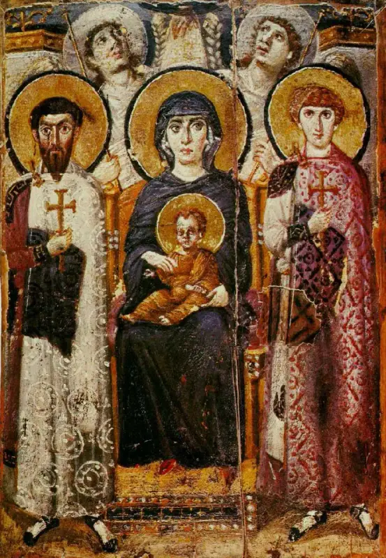
This piece, to me, looks slightly raised/curved, like it either wasn't meant to lay flat, has warped with time, or has some parts that are raised/higher than others as part of its design. Maybe it uses wax? It depicts Theotokos holding baby Jesus while sitting upon a throne, and what seems to me like saints of some sort (I don’t imagine priests, since they have halos)? They seem to be sort of soldier-like as well, though, armed, armored, and protective.
Above them all, two angels look up to what I imagine are the heavens, at God (?), who is producing light and shining it down on Theotokos and Jesus. It definitely feels like there’s a lot of upward movement in this piece, as even Theotokos looks up and to one side, like she’s watching for something out of the corner of her eye, and the angels look up further to God.
I also feel like we get a sense of hierarchy through this; the saints are in a world somewhat like our own world– with their feet touching the ground– Theotokos and Jesus slightly above– elevated on a throne, looking beyond us– and then the angels in the world of God and heaven, pointing up to it since we can’t even begin to imagine it.
The baby Jesus is definitely depicted as older, also! The hairline is weirdly pushed back, though he looks fairly normal otherwise, so it’s definitely leaning into that idea of depicting Jesus as older/wiser.
Maybe it’s just in the photo I’m looking at, but it also looks like there’s some reflection on one of the angels’ halos, kind of like the light on Theotokos is bouncing back onto him.
The color is very gorgeous in this piece. The gold leaf is stunning as always, but I feel particularly impressed with and drawn in by the lighting on the sort of saint-soldiers’ robes. The white one is very gorgeous and intricate, and the darker shading near the bottom is really satisfying to me as is the shadow on the red/purple rode.
That said, I’m a bit confused about the way the lighting works/where the light source is in this piece when I understand that there’s light shining down on Theotokos (that doesn’t seem to be making shadows– it’s Divine, fine), but there also seems to be a light source from the left side of the piece that’s making a sharp shadow under the left saint’s arm and a softer one under the right saint’s arm?
Theotokos Mosaic ; 867 AD ; center apse of Hagia Sophia, Istanbul, Turkey ; 16 ft height ; Mosaic

The art is incredibly brilliant, with an incredible gold (gold leaf?) background, and gold littering the clothing of who I assume is Jesus in Mary’s lap, alongside the stool and platform they sit upon, which seems to be It seems to be a mosaic, sort of fading away/peeling back. I imagine the gold would symbolize some sort of ‘light of heaven’ or ‘Glory of God’. Seating her on the stool/platform is interesting, as it suggests status in her inability to touch her feet to the floor (same with the jewels on her things).
Mary is wearing dark robes, which remind me of the version/period of her often referred to as Nuestra Señora de la Soledad, or Our Mary of Solitude (who my original name, Marisol, comes from). Of course, though, she is not currently grieving the loss of her child, as he sits directly in her lap. She has a very solemn look on her face, and her eyes look almost exhausted (to me). I wonder if he’s just returned? She has her hand on his shoulder, too, showing some amount of care and nurturing.
I like that Jesus is wearing sandals as a child, too, sort of emphasizing his image as a historical figure– especially in addition to his kind of adult face even though he’s a child.
I can’t tell if she’s in blue from just this image, though, so it’s hard to say if she’s actually in anything like that state, or if she’s just being depicted in blue like she often is.
Mary is much larger than Jesus is, though Jesus’s halo also has a cross within it. That said, I like that they’re both depicted as holy and important (I feel this sentiment goes away with time for many Christians, who emphasize God, Jesus, and the Holy Spirit much more than Mary).
I love how solid this art is with its colors– gold as its primary, and then some amount of white, green, red, and the dark blue/black of Mary’s robe.
Justinian and His Attendants, Justinian Mosaic ; 547 AD ; San Vitale, Ravenna, Italy ; 104 in x 144 in ; Mosaic
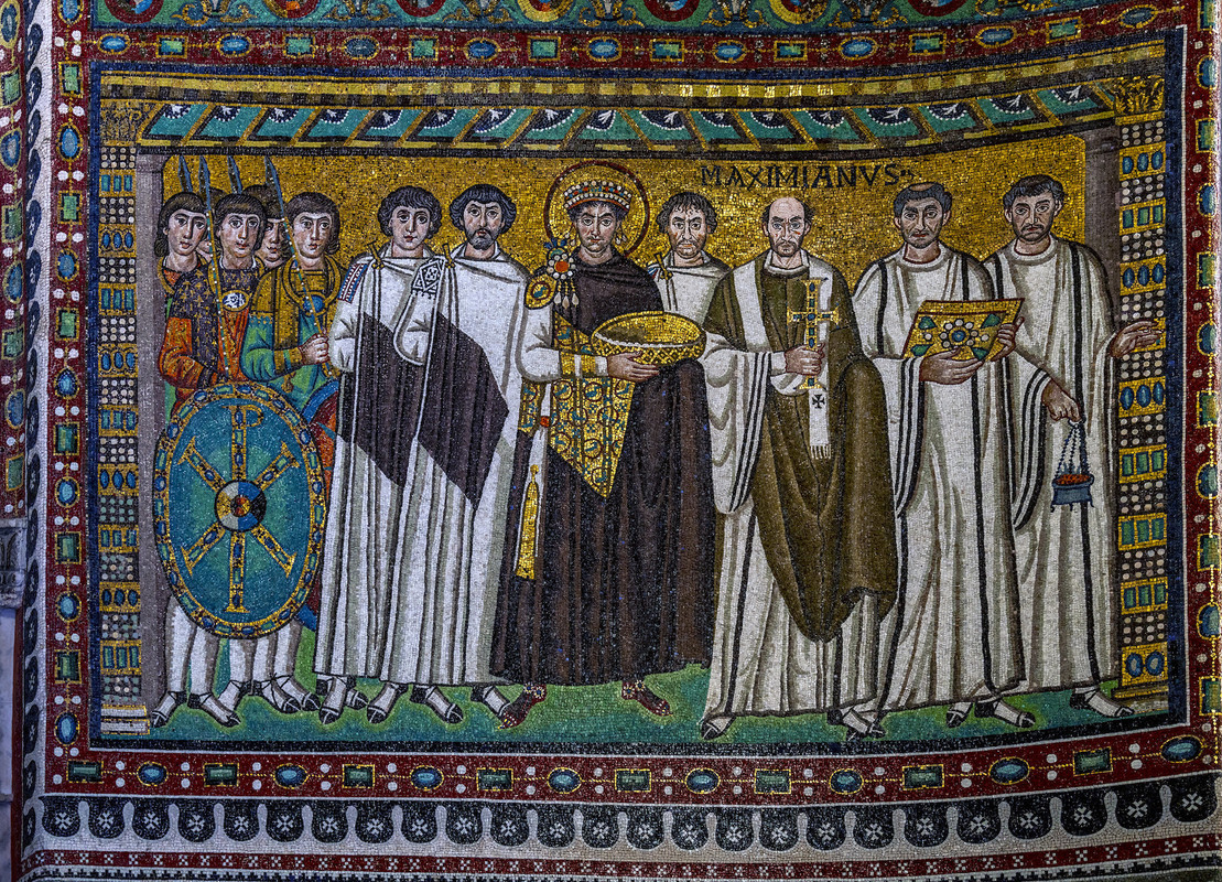
This piece, right off the bat, feels like some definite propaganda from the Emperor/King alongside the Church (Catholic, I imagine) and military. Our focal point is obviously the King/Emperor in the middle with a halo around his head, signifying his divinity and connection to that. We’re getting a very ‘divine right to rule’ sort of energy, and I feel that this piece is trying to show their collective power and collaboration as the general authority of whatever country/nation/empire this comes from. They all have very neutral expressions, and eyes that sort of stare through you– almost intimidating.
They’re also holding a whole lot of riches! The border is very beautiful, full of little gems that, in my eyes, also signify the wealth that comes with their authority. I’m curious about their color choices, with so many blues, greens, golds, reds, and then even some black, white, and orange. It feels like there’s a lot going on, but I do still feel like there’s a very central few colors. It’s not too chaotic.
I’m not super interested in the piece overall, but I’m really drawn into the color/temperature with so many cool tones and a sort of solemn atmosphere. I could almost imagine all these people standing as this painting is done of them (though it likely wasn’t done like that), and can feel the stale, stuffy energy.
This piece also depicts a fairly strong regression in realism and art ‘style’– no more exact contrapposto– and I’m curious as to why. It’s definitely mosaic, though. In the corner, we see a little bit of text that says ‘MAXIMIANUS’, which I don’t know exactly the meaning of, but I can guess is a name.
Ludovisi Battle Sarcophagus ; 250-260 AD ; the Vigna Bernusconi, Rome, Italy ; 59 in height ; Marble

This piece is a huge, incredible scene with so much going on in it. It seems to be pretty high relief, with different Roman soldiers fighting and clambering over one another. Some are riding or leading horses as well, and some people have fallen to the ground— spears in their chests and sides. It’s definitely a dramatic and intense scene with a lot of violence and death. I wonder whether the purpose of it was storytelling, to demonstrate power and strength of a people/army, or just to memorialize an actual historical war/event.
The huge slab stands on a couple pedestals with little lion figures on them, though I’m not sure how intentional the choice in animal was. It definitely does symbolize valor, strength, dedication, determination, etc, so it seems like the right kind of choice for a war scene.
I feel pretty overwhelmed by this piece— there’s so much going on in every direction, and the chaos makes me sort of tighten up. I imagine it’s the same for the figures in the piece, as a lot seem stuck between one another, or trying to comfort themselves while in pain. Others seem really determined and need to move forward.
We do definitely see two ‘sides’ in this piece, though— with a more heroic, noble, and civilized Roman army and then the other people in more casual clothing, depicted a bit more like barbarians as they grab at all the Roman soldiers. The ‘barbarians’ are very squished to the bottom and have expressions of agon and have beards (I wonder if it’s an expression of lack of civilization in them), so that we get a sort of hierarchy among them (the Romans are clearly winning). I have to say, though, that we also get a sense of protection within the piece with some figures. For example, I see one interesting scene of a soldier with his hand around the jaw of another man who’s sitting in front of him, his shield cast around him as if to protect him.
I also feel like, despite all the chaos, we do have a sort of focal point, with a man riding a horse in the center of the piece, one arm out as if to gesture to a crowd. I wonder if he’s some sort of beloved leader, or someone the artist is trying to glorify for one reason or another. His gesture is a sort of oration gesture, and reminds me of previous depictions of Augustus.
Head of a Roman Patrician ; 75-50 BCE ; Otricoli, Italy ; 1.16 ft height ; Marble bust

This piece is incredibly striking– intricate details throughout the entire face, with deep wrinkles, sagging jowls, and a furrowed brow, alongside some scratches/scars, birthmarks, and other imperfections. There are some lighter wrinkles on the neck, too, that are really well done. I’m enamored with the commitment to realism, and curious as to why the artist chose this man to depict.
I wonder if it’s some sort of dedication to ancestors/heritage/history, or a symbol of the society’s (Roman’s?) pride in those things. It’s like they’re displaying that they admire age as a symbol of knowledge, wisdom, and experience. Unlike the ideal bodies depicted in a lot of Greek art, he’s an ideal in a mental context. If this is commissioned, he’s not trying to make himself look perfect, but unique and powerful in his own right.
He has some really sharp facial features and a very focused expression, and in general, it’s such a specific, non-ideal (physically, at least) depiction of a person, that I imagine they were likely wealthy/powerful in their life (or maybe it’s just a representation of the power/wealth that can come with age generally). In that case, they’d likely be some sort of patrician.
The eyes freak me out a little bit, but also clue me in to the fact that this piece was definitely originally painted in many colors that have since worn off.
I really love this depiction in general, though. I love how deep the wrinkles are, and how worn the face feels all around. It feels like I could reach out to touch the skin and it’d be soft, warm, and fleshy. Even though he seems really stoic and intense, he also feels sort of like a grandparent. I can see his vulnerability and honesty behind the way his face rests. I also really like how the wrinkles all around almost make him feel tree-like to me.
Augustus of Primaporta ; 20 BCE ; Villa of Livia, Rome, Italy ; 6.83 ft height ; white marble, likely a copy of an original bronze

The piece is interesting and odd from the get-go, especially with the inclusion of a little baby seemingly holding onto the Roman man’s leg/cloth. I imagine the baby is a Cupid, as he seems to have the beginning of a wing behind him, and I find that odd baby-things in Roman and Greek art usually have Cupid (or specifically Eros/Psyche). I can’t tell what exactly the baby is on– some sort of animal or thing? It seems like it’s diving forward, so it could be a shark/dolphin/whale of some kind, or maybe even a diving bird.
The man himself is clearly Roman and of great importance, and reminds me of depictions I’ve seen of Augustus, the first Emperor of Rome, but I couldn’t say that it’s him with 100% certainty (I’ll still refer to him as such throughout this). In my eyes, this piece is a clear display of power. Augustus is wearing a beautiful, intricate breastplate that depicts scenes of battle (I can’t tell which battle) alongside the Gods to draw attention to his power in battle and war, and especially his victory, while also emphasizing his divine connections. He also seems to be pointing away, which is a very commanding position– maybe toward an army or his subjects, or possibly orating in general.
I’m not sure exactly how the Cupid ties in, since a god of love feels like an interesting choice, but I imagine it’s just a show of connection to divinity and culture/history as a whole– really just adding to the propaganda of this image and helping to make him look like a jack of all trades. Also, if I remember correctly, Julius Caesar to be the son of Venus, so that could be part of it.
I’m really impressed by the cloth around his waist. It’s incredibly detailed and high relief, and it’s folded around itself in a really elegant way.
I think that he all around feels like a very imposing figure in this piece. His contrapposto stance is strong, and he’s not afraid to take up space with his body language. His expression seems fairly casual and nonchalant, but it’s still serious and intense. I feel smaller while looking at the piece, and the air is more tense. I think it’s likely made of marble or stone of some kind, but I can’t quite tell.
Alexander Mosaic ; 100 BCE ; House of the Faun in Pompeii, Rome ; 8.92 ft × 16.67 ft ; mosaic, made of 1.5 million tesserae
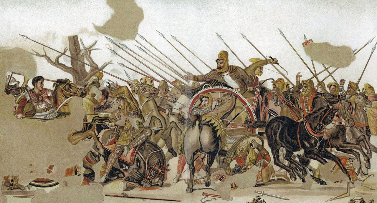
I felt struck by this piece right away– the fear that seems to encircle all its inhabitants as they ride into battle against one another. There feels like there's some Persian influence of this art, though I wonder how much of that is just because of the subjects they’re depicting. On the right, we see one side of the battle– maybe a Persian army– and the Macedonian side of the battle on the left (I’m guessing based on my very vague knowledge of the Greco-Persian wars).
It feels like this is a really big turning point in whatever this battle is. It’s chaotic– there’s people crushed between the wheels, all the spears are pointed to one side, and there isn’t a clear story of a winner or loser, moral one or evil one. That said, I’m sure there is a winner, and this does seem like a very large show of power. It’s commemorative but sort of like propaganda– a display of hard power to prove their strength and superiority.
One of the more notable things is that a person to the left of the chariot has been stabbed by someone who is maybe Alexander the Great, though it could be some other Macedonian figure– the others pointing and staring, upset. Just knowing that makes it clear that he’s winning, but it’s interesting that the Persians are placed so highly above composition-wise. (maybe to suggest that they were so powerful, but still couldn’t win?).
The person in the chariot points toward the man stabbing him, but it seems to me like the men upon the horses in front of him are dismounting, maybe just to fight on foot, but I imagine more likely to abandon the battle. I guess that suggests even more strongly that this is a depiction of the beginning of the end for the Persians.
Apollonius Seated Boxer ; 100-50 BCE ; Quirinal Hill, Rome, Italy ; 4.2 ft height ; bronze with copper inlays
The man looks off into the distance, very exhausted and in pain. I get that feeling even more because his wrapped hand reminds me of that of a boxer or fighter of some kind, making me think that he might’ve just gotten out of a fight of some kind. He also has cauliflower ear, which makes me even more certain he’s a boxer. I can’t tell if he’s defeated, exactly, but he’s definitely drained. His expression is really dramatic and intense, and it almost looks like one of despair, so maybe maybe he has been defeated. It could also just be a very intense depiction of pain and exhaustion, though.
All that said, the way he’s seated still looks really powerful to me. He has a strong ‘stance’ (for lack of a better word), and seems like he’s also a bit energized and ready to fight again– maybe has some adrenaline running. His feet are hovering off the ground, and it feels like there’s some sort of potential energy in the way he’s positioned.
I wonder if there’s any meaning to this piece outside of it being a depiction of a human experience– could it be a sort of symbol/talisman, almost? Is it just a piece for decoration in the home or the city, or is it something that might exist near a boxing ring? Could it have some sort of significance in how it shows someone being able to handle pain and exhaustion– maybe a reminder to do the same, or a good luck charm that you’ll be able to? If he is a defeated boxer, could there be something about losing with grace?
I don’t have much to point out about it, but I really love the smoothness of this carving– each surface feeling very rounded and well-carved. The shine off every surface almost looks like glistening sweat, or an oiled body. Also: the color definitely isn’t intentional as bronze always gets discolored like that, but I feel like the way it exists on this piece really compliments it.
I really love everything about the way he’s positioned and the expression on his face. It feels like I’ve sat exactly like this before at the end of basketball games and things of the like. There’s a certain sort of competitive anguish in him.
Grave Stele of Hegeso ; 410-400 BCE ; Kerameikos Cemetery in Athens, Greece ; 1.58 m height ; Marble and paint
The two figures in this piece are holding either side of some object, which looks like it might be a little chest or tray of some kind. One figure sits upon a simple chair, curling one hand upward as if making a gesture of some sort and holding the object with the other, but sort of loosely, as if they’re trying to hand it off– only still touching it to make sure the other has a grip on it and it won’t fall. The standing figure looks down at the other, holding the chest/tray rightly in one hand.
They both seem to be women and neither have very happy expressions, but the sitting figure seems more upset, with a sort of glowering look on their face, while the standing one has a soft, confident, maybe even smug smile. I’m curious as to what the context is– maybe the sitting figure has lost something, whether status or money or something else, to the other, and is frustrated at having to give it up? I could be looking a bit too into that, though.
The seated one does have a seemingly more elaborate hairstyle/headdress, while the other is dressed simply, and the seated one is clearly much larger than the other, as well, which makes me think they’re more important– maybe a goddess or just royalty of some sort. Also, the seated one is depicted in much more detail than the other.
They’re very close to one another, with the standing figure being almost between the sitting person’s legs, and I’m curious as to why that might be. It makes me wonder if they might have a more intimate relationship of some kind.
Also– a big thing is that the standing woman’s boob is out! I’m curious as to why. Maybe there’s some sort of sexual relationship?
Outside of the art, there is the fact that this piece is clearly displayed on the side of a steele/headstone of perhaps a mausoleum (I can’t tell the size/if there are other sides). It’s made of stone, which definitely adds to the idea that it’s made to last, perhaps for some funerary thing. There’s words across the top of the building, though I don’t know what they say– probably some sort of ‘Rest in Peace’ thing.
Sarcophagus of the Spouses ; 520 BCE ; Caere, Etruria aka Cerveteri, Italy ; 3.7 ft × 6.2 ft ; Terracotta ceramic

I’m immediately amazed by this piece. It’s broken in half, which interests me, as I can’t really think of why it would be. That said, to me, it plainly seems like a sarcophagus shaped to look like a bed. Upon it lie two figures, sort of in a reclining position. I feel like there’s a bit of a twisted perspective to it, like maybe the anatomy’s a little bit off, with the way the feet/legs are angles as opposed to the torsos. My other idea, though, is that it could be representing their spirits rising out of their bodies, and maybe the sort of twisted perspective is very intentional in that regard.
The woman is wearing a little headdress over her long hair that seems to be in braids or twists of some kind. The man behind her has fairly long hair as well, alongside a very solid beard, and his arm drapes across her back, his hand on her shoulder. It’s kind of interesting, because she seems to be almost entirely dressed, though I can’t tell if she has a top on, or just a shawl, and he has no shoes or shirt, and possibly no bottom.
They definitely seem to be wealthy– maybe some kind of aristocrats– which I gather from the frilly pillows and nice bed frame alongside the beautiful shawl. Despite being a sarcophagus, it doesn’t really seem big enough to hold a body, so maybe it’s just for ashes, or I’m wrong and it’s something else entirely. I can’t quite tell the scale, though, so it could just be really huge (perhaps meant to hold a family, or two partners, or a person and their valuables). It’s also interesting and lovely that such a sweet scene is being associated with death in this piece, which reminds me personally of Mexican traditions of remembrance and love for the dead– much livelier and less tragic.
I’m curious about the context of them reclining in bed like this. Both seem to be smiling and gesturing, and his arms relax around/near her. I wonder if maybe they’re having some sort of animated discussion, or maybe just preparing themselves for bed– removing parts of their clothing, whether it’s for sleep or for sex or something else. I think a shawl is draped not quite over her shoulders, but around her arms, which sort of adds to that image for me.
It’s interesting because she isn’t holding anything, which makes me think she’s lost whatever she was originally holding. By the way her hands are set, I imagine it was some sort of bottle, though I’m not sure of what.
Either way, I really love the really intimate scene that’s being painted. The two feel very in love to me, especially in the way he’s holding her, and the soft expressions on their faces as they lie together. I can feel the good time they’re having, even though I have no idea what the context is.
Hunefer’s Judgment in the Presence of Osiris ; 1275 BCE (19th Dynasty Egypt) ; Thebes, Egypt ; 39.8 cm height ; Papyrus scroll
Looking at this image, I’m immediately struck by a few things. One is that the scroll-like layout reminds me of what we’ve learned of the concept of creating a Book of the Dead, and so I wonder if this is a part/scene in someone’s. This is also supported, in my eyes, by the fact that the figure is guided by Anubis, the God of the Dead, and meets Horus, the god of protection among other things.
The main scene seemingly depicts one of the judgment trials within Egyptian mythology, where a heart is weighed against a feather, and if it is heavier, then the alligator-dog creature (whose name I can’t remember) eats it and your soul does not progress.
I personally can’t say I find this scene very emotional, evocative, inspiring, etc, as it feels like a very straightforward depiction of a story. It is definitely more positive, as nothing bad is happening to the person, which makes sense, as a Book of the Dead is meant to portray your hopes of the afterlife– sort of manifesting reality. I am intrigued by two of the scenes within it though, the stories of which I’m less familiar with. I imagine that they are also judgment trials of some sort.
I like that Anubis has taken the person’s hand as he’s guiding them, though. It’s a nice detail that I do feel inspires some amount of emotion, and I like the depiction of him as a sort of supportive, comforting figure throughout these trials. He doesn’t harbor any ill-will, just is doing his job in guiding you through the necessary trials.
Horus, to me, feels a little more to the point. He doesn’t seem to have as much of a comforting aura– maybe a bit more demanding and to the point, though he does also hold the ankh in one hand as Anubis did. He seems to be guiding him to the green-skinned figure in the right panel who’s wearing a pharaoh's crown (seems to be a depiction of Osiris), but I don’t exactly understand what they’re doing or what the situation is generally. There are women behind him trying to get his attention, maybe, and Horus is flying above him (now depicted as a full falcon). He’s the god of resurrection, and so I imagine that some other aspect of the soul’s trial or general process of achieving rebirth/eternal life.
The scene along the top makes me wonder if it’s sort of the last aspect of the soul’s journey after death, or maybe some sort of remembrance of his life on Earth– paying his respects to the different Gods. It’s kind of interesting that some in the front of ankhs, though, and some in the back do not.
House Altar: Akhenaten, Nefertiti, and Their Three Daughters ; 1351-1334 BCE (18th Dynasty Egypt) ; Tell-el Amarna, Egypt ; 13 in height ; limestone stele

Two main figures, one man and one woman, sit across from each other on cushioned chairs, with what looks like cushions under their feet as well, and both hold smaller beings on their laps, and one crawls across the woman’s shoulder. I assume the smaller ones are children because of the way they’re interacting with the bigger parents (I’ll explore that later), but also wonder if they could be humans because of their weirdly adult-like proportions, with the bigger figures being the Gods.
One is holding the small figure up to his mouth, I think kissing it or showing it affection, but the face also doesn’t look that affectionate, so I’m not sure if it’s something else. On the woman’s lap, the small figure points at the other two while looking up at her, seemingly trying to show them what’s going on, and the one on her shoulder is pushing her head to look at the others, too.
I’m curious as to what the story is, and am somewhat reminded of how Cronus ate his children, who turned out to be the Gods, in Greek mythology, though I can clearly tell that this is an Egyptian piece, and not a Greek one. I get a feeling that it's not about that at all, but it just reminded me of it.
On a separate note, a sun in the middle-top shines down upon all figures present with little ankhs at the edge of their rays, making me think that maybe the figures are important, having eternal life bestowed upon them. That idea definitely feels supported by the fact that the man is sitting up straight and seems to have a fairly big headdress/crown and the woman is wearing a small headdress and slouching forward. It’s interesting, though, that their bodies don’t seem to be ‘ideal’.
Also, I’m intrigued by the fact that the woman and man are both painted the same size, insinuating that they’re ruling together. That said, there is clearly a power differential between the small and big beings. The fact that it’s in stone always gives a sense that it was truly meant to be permanent, and because of the implication that the big figures are pharaohs, I wonder if it’s dedicated to their children/inheritors to the crown, sort of trying to announce their futures.
There’s a lot of text (hieroglyphics?) surrounding the image, though I obviously can’t tell what it says, and I wonder, again, what story it’s exactly trying to tell (could also be a recreation of a myth of some kind, through art & engraving).
Along the right side of the image, there seems to be a staff or column of some sort that has what could be a sort of bird figure on the top (Horus?), but I can’t tell, as it also looks sort of just like a handle of a cane/staff.
Large Kneeling Statue of Hatshepsut ; 1479-1458 BCE (18th Dynasty Egypt) ; Deir el-Bahri in Thebes aka Luxor, Egypt ; 261.5 cm height ; granite figure
An Egyptian pharaoh kneels, both their hands holding two little spheres– maybe little vases or vessels of some kind? They’re kneeling upon a big stone piece of some kind, which I don’t imagine has much significance. It’s possible that there was some inscription on it at some time, which has now faded away.
There’s something around their waist that looks raised, like maybe it’s a belt of some kind, but I can’t tell. It’s been worn down very thoroughly– maybe through specific handling, but likely just through time. It’s hard to distinguish a lot of features from one another, the nose, eyes, and lips being very simple, and the ears, fingers, and feet standing out the most. There’s definitely some patterning in the headdress and beard, but it’s definitely light and faded. The piece has a lot of cracks as well.
I definitely feel a lot of balance in this piece, though, with a very strong sense of symmetry.
I’m intrigued by how humble they look, relaxed in a posture that seems to be praying or offering themselves to something– I imagine the Gods or a specific God. Especially with the little pots, it makes sense that they’d be praying/offering something, and I feel like this piece would have been used in a ceremony of some kind, and was likely made as a dedication to another God (sort of like the Palette of King Narmer, though that one was just decorative). It’s stone, too, which suggests the hope of permanence, and adds to that idea.
It makes sense to me as a piece– trying to show that even the pharaoh is not above the Gods, and that all should offer themselves.
Seated Scribe ; 2620-2500 BCE (4th Dynasty Egypt) ; Old Kingdom of Saqqara ; 53.7 cm height ; painted limestone statue, rock crystal eyes, magnesite, copper-arsenic alloy, and wooden nipples
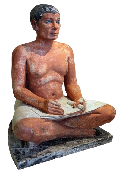
He seems peaceful, somehow, staring out at the world with a small smile and full eyes. I think his high cheekbones definitely add to that sense of peacefulness, joy, and even confidence in his eyes. His shoulders are relaxed, as is his core– leaning gently forward, though not slouching– and the crossed legs make me think that he might be resting or meditating, or even just working on something small in his hands.
In one hand, he’s holding some sort of writing utensil, with some sort of paper or stone slate of some kind in his lap (unless what’s in his hand is just rolled up paper). The other hand has his thumb pinched to his pointer finger, but I can’t tell if he’s holding something between them or not.
Mixed with the fact that he’s looking upward, as if he’s looking for guidance from some other being, which I think reaffirms the idea, I wonder if he’s some sort of scholar, scribe, priest, etc. It’s interesting, though, because he’s not depicted as a sort of ideal man– he has rolls and is a little slouched and only wears a skirt, making me think he’s not particularly powerful or viewed as very grand.
Also, the darkness around his eyes makes me think of kohl, so I wonder if he’s meant to be North African or West Asian.
He’s a very life-like character, in general, which sort of feeds into the idea that Egyptians view statues as sort of alive in their way (their word for a statue even meaning ‘living image’). It’s interesting to see the scribe be portrayed working, which I don’t feel is a commonly depicted job.
Palette of King Narmer ; 3200-3000 BCE ; Hierakonpolis aka Nekhen, Egypt ; 63.5 cm height ; smooth grayish-green siltstone ; ceremonial, special palette of some kind
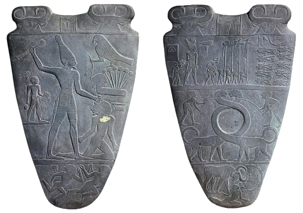
This piece is composed of two same-shaped stone pieces, almost flask-like with triangular bodies and a flat-ish top. To me, the piece’s distinct style is clearly Egyptian. Both depict their own scenes with several layers each, which reminds me of descriptions of the world and its afterlife in layers– maybe one with the living, one with the dead, one with the Gods, etc.
On the left piece, there’s one main layer with a smaller one below– the main one picturing a man (maybe a King or a God) seemingly getting ready to either bless or maybe strike (the second feels more likely) another man who kneels beside him, held by the hair. A bird (associated with Horus, who’s associated with kings) stands beside them, and a little man on what looks like a shelf on the other side. Below the floor under them is what looks like two nude people running from something, maybe defeated/humiliated in some way.
On the right piece, the piece is split into three somewhat equal layers. The middle one holds what looks like two lion-type creatures (serpopards) with incredibly long necks intertwining with one another, and a man atop each one who seems to have them lassoed/on reins of some kind, like they’re trying to hold them back. In the top one, I’m honestly not too sure what’s going on. There are an incredible amount of figures doing different things– some looking almost like children. One is wearing the crown of upper and lower Egypt, which is interesting to me. The figures along the right are laid on their sides, missing heads, so it’s definitely a violent scene. In the bottom layer, there’s a bull stomping on the arm of the man, and knowing that bulls tend to be associated with pharaohs, it feels like another display of dominance of leadership.
One similarity between the two pieces is the two little creatures atop both that look sort of like bulls or rams with human faces, and some sort of seal between them.
I’m honestly not too sure what’s going on in the piece, but I’m intrigued. There’s a lot of movement in both that reminds me of a sort of mythical scene. Maybe the pieces are meant to be a part of storytelling of some kind. I think the lack of a focus in the pieces makes it hard for me to really get a sense for what’s going on, especially without any other knowledge outside of just what I can see, and I could definitely imagine someone sort of leading you through the images to tell a story.
That said, I do definitely feel like that idea of different layers of the world keeps coming back to me. As an example, I can see that in some layers on each, there’s a bit of a theme of suffering, which makes me wonder if it’s trying to represent the different parts of humanity or something of the like.
I imagine that its use is related to something more decorative– maybe made for nobility of some kind? The piece, to me, is very striking. It feels very powerful and intense, with lots of scenes of intimidation and humiliation. I imagine that this is meant to be intimidating and intense– something to legitimize power. Since it has the falcon which is associated with Horus, I do imagine it’s sort of dedicating itself to the idea of a tie between the pharaoh and Horus.
Tlatilco Female Figurine ; 1500-1200 BCE ; Tlatilco, Mexico ; 9.5 cm height ; this type of figure is very common, usually in a brown tone & of an ideal body type (though can be much more varied in their representation of the human body), and this one is part of a large collection
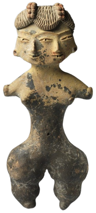
I’m noticing a pattern in myself of loving flowing movement and smooth curves in art, and in this piece I'm drawn immediately to look at the wide hips that branch from such a thin waist and torso, along with the way the legs look almost like little stacked blobs. It makes me wonder if they could’ve been wearing some kind of wide pantaloon the details of which were erased with time? I especially wonder so because the piece seems to have two different colors– one dark and faded, and one a bit brighter and more detailed.
It’s interesting to me that the figure doesn’t have arms, but it almost seems like they do have little fingers. It reminds me of ‘nubs’ that people sometimes have if their arms/hands don’t fully form. It could also be a sleeve of some kind, but we can clearly see the figure’s breasts and nipples, which makes me think not. An armband?
Of course, the being has two faces, which is definitely an interesting component. I’m reminded of a lot of different deities with several faces like the two-faced Roman Janus– god of doorways, crossroads, new beginnings, etc. and even Hindu Brahma– known as the Creator, whose four heads represent the four Vedas and are pointed to the four cardinal directions.
It makes me think of them also as a deity, and combined with the sort of mischievous look it has (a little grin and eyes that could just be a depiction of monolid eyes, but even then look like they’re almost squinted in excitement), I wonder if they’re some kind of deity. Maybe a trickster God of some sort? It especially makes sense with the idea of two-facedness being a symbol for liars, manipulators, etc. It could also just be representing duality in some regard?
Also, it looks like they have eyeballs or spouts or something circular in their mouth? I don’t know quite what’s going on with that, but I’m curious about the idea of them as being watchful and sort of a counterpart to the playfulness/trickster energy.
I’m curious as to what’s going on with the incredibly textured hat/hair/headdress? It almost looks like snakes or fruit or even udders of some kind, but I could also see it being some sort of string of beads.
I could also think of the piece as a talisman of some kind, but if it is a trickster, I’m not sure why it would be carried with you. The big hips could suggest fertility as well. In that case, the two faces could represent a community with childbirth and raising a family? Or, if we blend the two ideas (fertility and mischievousness), they could be a sort of representation of lust.
Running Horned Woman ; 6000-4000 BCE ; Tasilii, Algier ; plateau on one of largest massifs in Tassili N'Ajjer National Park ; 13 feet height

I’m intrigued from the first moment by the flowing movement of the figure’s body as they run– the way their joints are soft and rounded– but how the limbs are cut into sort of rectangular joints at the same time. The image feels very geometric.
I almost feel like there are two versions of the figure– one made from their solid body, dark and tangible, and the other from the white dots (scarification?) and lines that surround their head and body, whether it’s clothes or just an essence of their self. In fact, I feel like the entire image is sort of grappling with these two layers– one of the dark and one of the light, sometimes overlapping, and sometimes shown starkly against each other (as in the way the white outlines some darker bodies, or in the figure in the bottom right corner).
The figure has what seems like horns, which interests me and makes me wonder if they’re some kind of deity or mythological figure, famous or not– and also because of the scale between them and the other beings. I also wonder if maybe the horns are a weapon through their head, instead?
I’m also curious as to what they’re holding. At first, it looks to me almost like some sort of string or whip or something, but then I realize that there aren’t clearly defined hands, and I wonder if maybe it’s part of the cuffs/gloves/something else around their hands. Also– the band around their upper arm feels like flowing water. Why are there dots around their head, or the little patch of what looks almost like grass atop all the dots? Or maybe it’s a cloud with rain? Is it a headdress or halo?
Smaller figures surrounding our main focus draw my attention me mainly because it’s hard to tell where exactly in space they are, but I love at the same time how they seem to be moving around our main figure– holding up the cloth over their pelvis, and maybe hunting or fighting or dancing (I can’t quite tell). It almost looks like they’re holding the white strings coming from their wrists, too. I wonder why exactly they might not have heads, which leads me back to that idea of hunting or even war? I wonder if this art is trying to tell the story of some event (or myth).
There are three figures around the image that are particularly unique– one I can’t place on the left side, that looks to me almost like a little straw creature or man, one in the bottom right that I truly can’t place, but looks almost like different rocks or a little cutesy bear head, and the more defined figure between the main figure’s legs– someone with their breasts elongated and pulled forward and a straw skirt on, underneath an arch that looks almost like a rainbow. I’m curious to know more. They have the same dot patterning on the body as the main figure– scarification.
I don’t know quite what to say about the piece. Our main figure feels almost frantic to me– reminding me of an archetype I feel I know through different films and stories of a great, kind creature that cannot be saved, and ends up left behind somehow (I still love you, brachiosaurus in Jurassic World), yearning for more. Maybe that’s influenced by the great horns on their head, and the soft rolling shoulders. They feel too soft for the situation, somehow– like their body and mind are too gentle and warm for it– and as they run, swaying, their arms flailing, they feel hopeless and frantic and desperate and sad. Maybe they’re a God running with their people, sad for their loss and what they couldn’t help. I’m not sure. That’s just the energy I get.
